England Lacrosse
A positive brand identity for England’s aspiring athletes
England Lacrosse’s athlete development programme is the only one of its kind in the country. With changes to the programme structure and a new intake about to join, they needed help to explain and sell everything the programme has to offer. And just as we began the project, things got seriously exciting: Sixes Lacrosse was confirmed for the 2028 Olympics. So the stakes couldn’t have been higher.

Thinking
We were briefed to create a new name, tone of voice and visual identity. Our work had to be an extension of the England Lacrosse brand that felt fresh and exciting. And it needed to connect with a range of audiences from players to parents, clubs and schools.
The branding would need to balance fun, youthful and aspirational cues with serious undertones. Because at the end of the day, this is a prestigious programme known for training elite international players. And having joined the roster for LA 2028, England Lacrosse wasn’t just looking for brilliant athletes. Now, they were seeking future Olympians.
Outcome
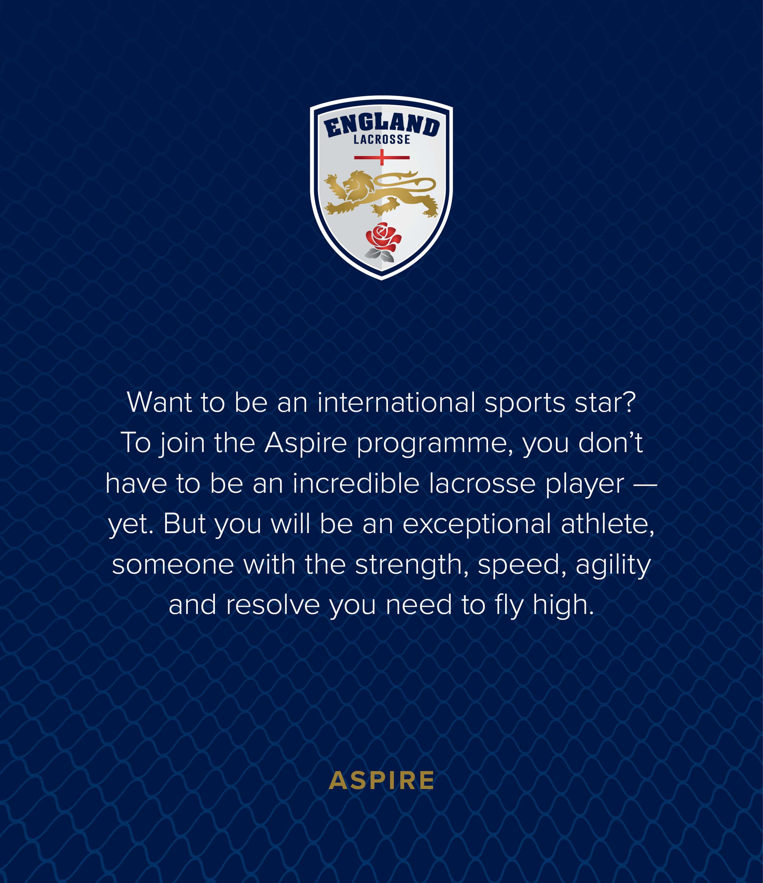
Before we could get started on anything visual, we needed an inspiring name. It had to sit alongside the higher tier ‘Performance’ programme and hook prospective players (along with their parents, clubs, or schools). So we worked with Yarn to explore a number of descriptive options, eventually agreeing on ‘Aspire’. It’s active, punchy, and positive, with a powerful feeling of upward momentum.
The name set the theme for the visual identity. Building on the existing England Lacrosse branding, we introduced a gold-based colour palette, bespoke icons and bold typography that interacts with player photography. We topped that off with typographic illustrations by Oli Frape, which bring the inspirational messaging to life. Then we collated everything in a handy guideline document for the internal design team.


The current England Lacrosse colour scheme is mostly shades of red, complemented with accents of blue, white, and gold taken from their logo. We decided to reserve red for the master brand and distinguish the Aspire programme with gold and blue primary colours. It’s a subtle, but effective, difference, helping Aspire programme materials to stand out against any general England Lacrosse marketing.


England Lacrosse already use a simple, sans-serif font on their website but were using a range of other typefaces across their various materials. To provide consistency we confirmed the use of Proxima Nova for all branded materials and selected contrasting condensed and wide typefaces that can be used together for bold, energetic messaging.


We created a range of inspiring supporting messages for the programme, then commissioned lettering artist Oli Frape to turn them into attention-grabbing illustrations. The phrases themselves elevate the key messages of Aspire, speak to the goals of potential athletes, and excite audiences about the programme. Illustrated, they’re unmissable — and lend a fresh, energetic feel to the brand.


Lastly, we selected a suite of icons that can be shown in outline and fill versions depending on their background, size and use. Altogether, the name, messaging, and visual brand are both prestigious and youthful. Just what England Lacrosse needs for their aspiring gold medallists.


