JCStrength
A no-nonsense personal training identity that links body and mind
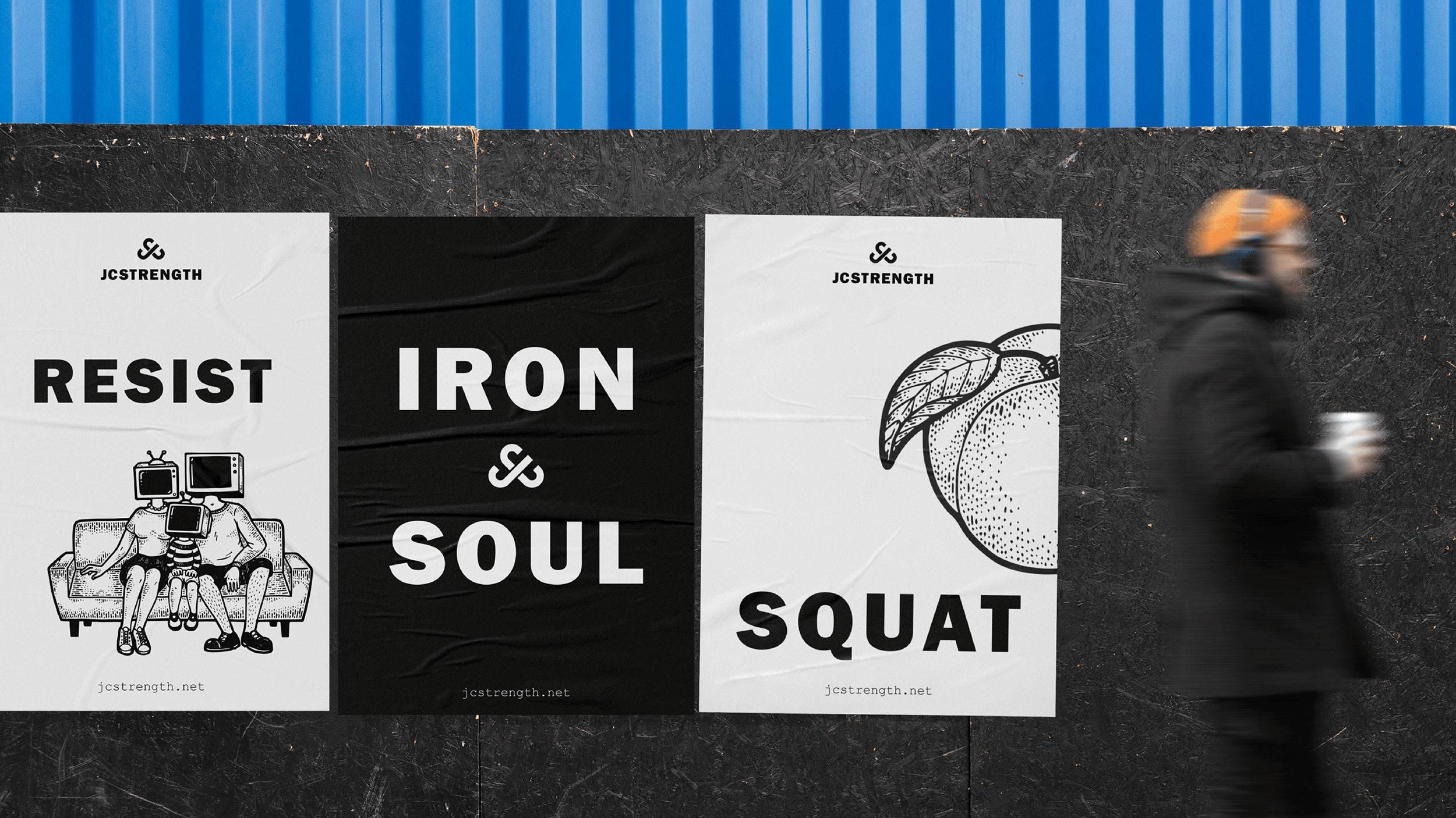
JCStrength is about more than sets, reps and protein shakes. Founder James Coutts believes long-term fitness is a mental and physical journey rather than a quick fix bought in the gym. And for his honest approach to personal training, he wanted a no-nonsense visual identity that would cut through the usual fitness jargon and catch the eye of aspiring athletes.
Thinking
Training with JCStrength demands thought and attention. James is passionate about the link between body and mind, believing the best results come from the right mindset. He was also keen to leave the polished Instagram fitness world on the rack and create something grungy and rebellious instead. The sort of thing you might see graffitied on a wall in his hometown, Bristol.
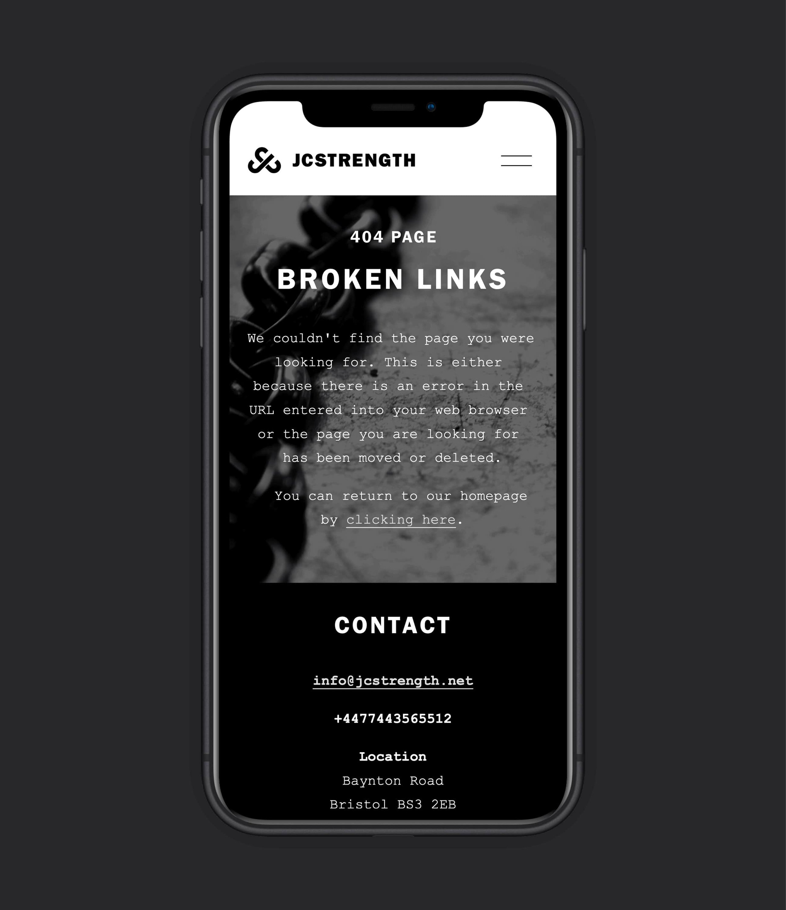
Once we started exploring, we kept coming back to links. Between body and mind. Between trainer and trainee. Between everyone in the fitness community. So, we used them as the basis for a thoughtful brand identity.
Outcome
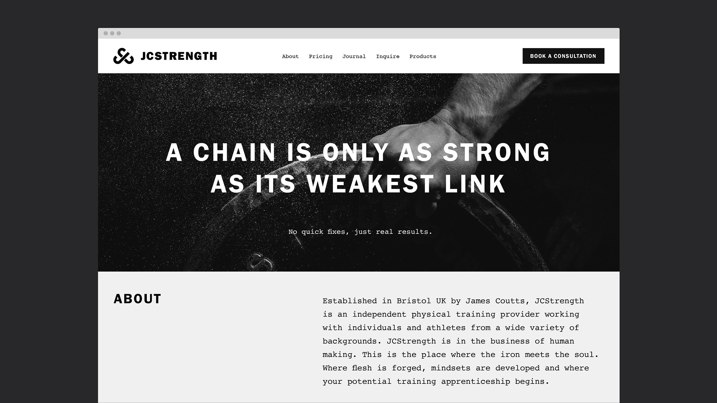
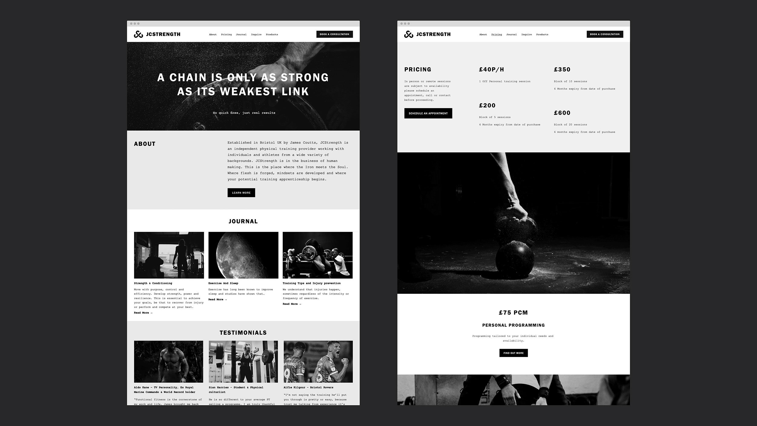
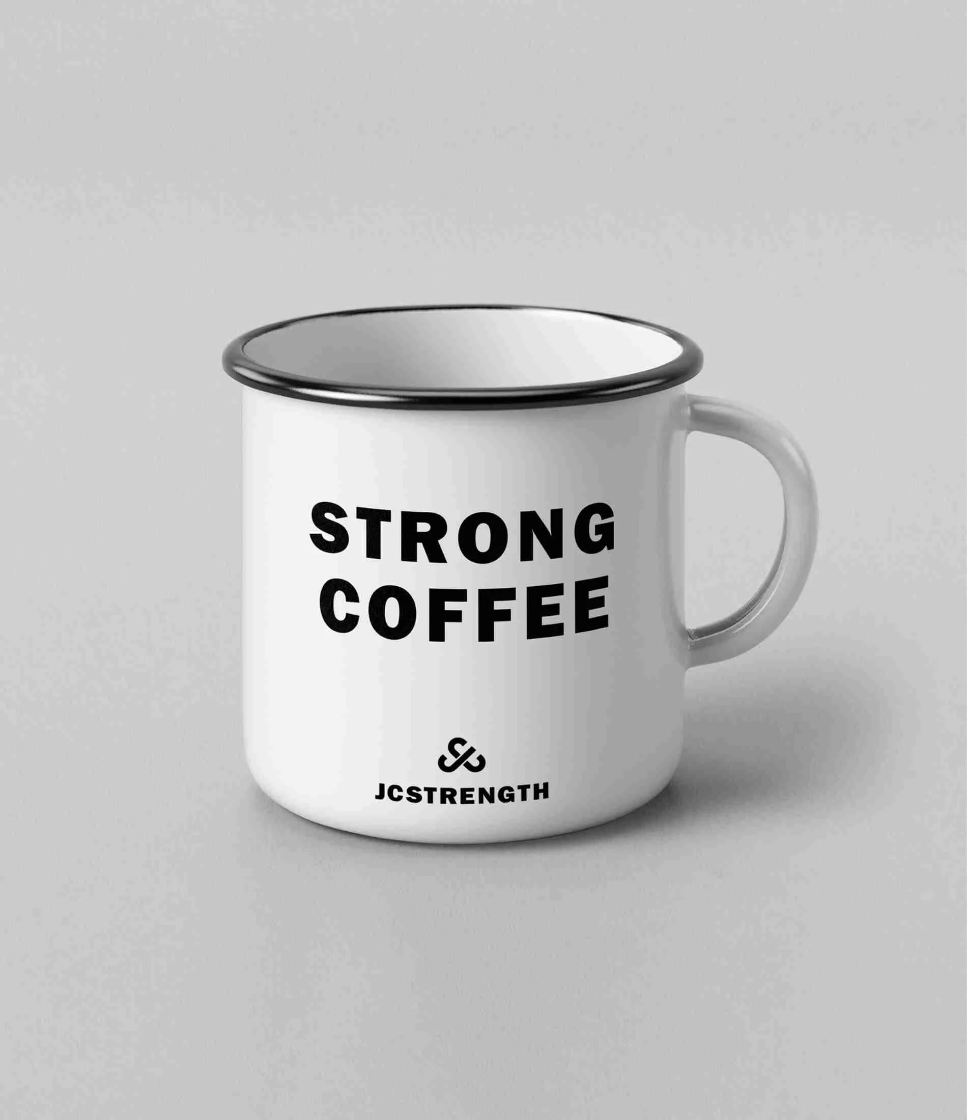
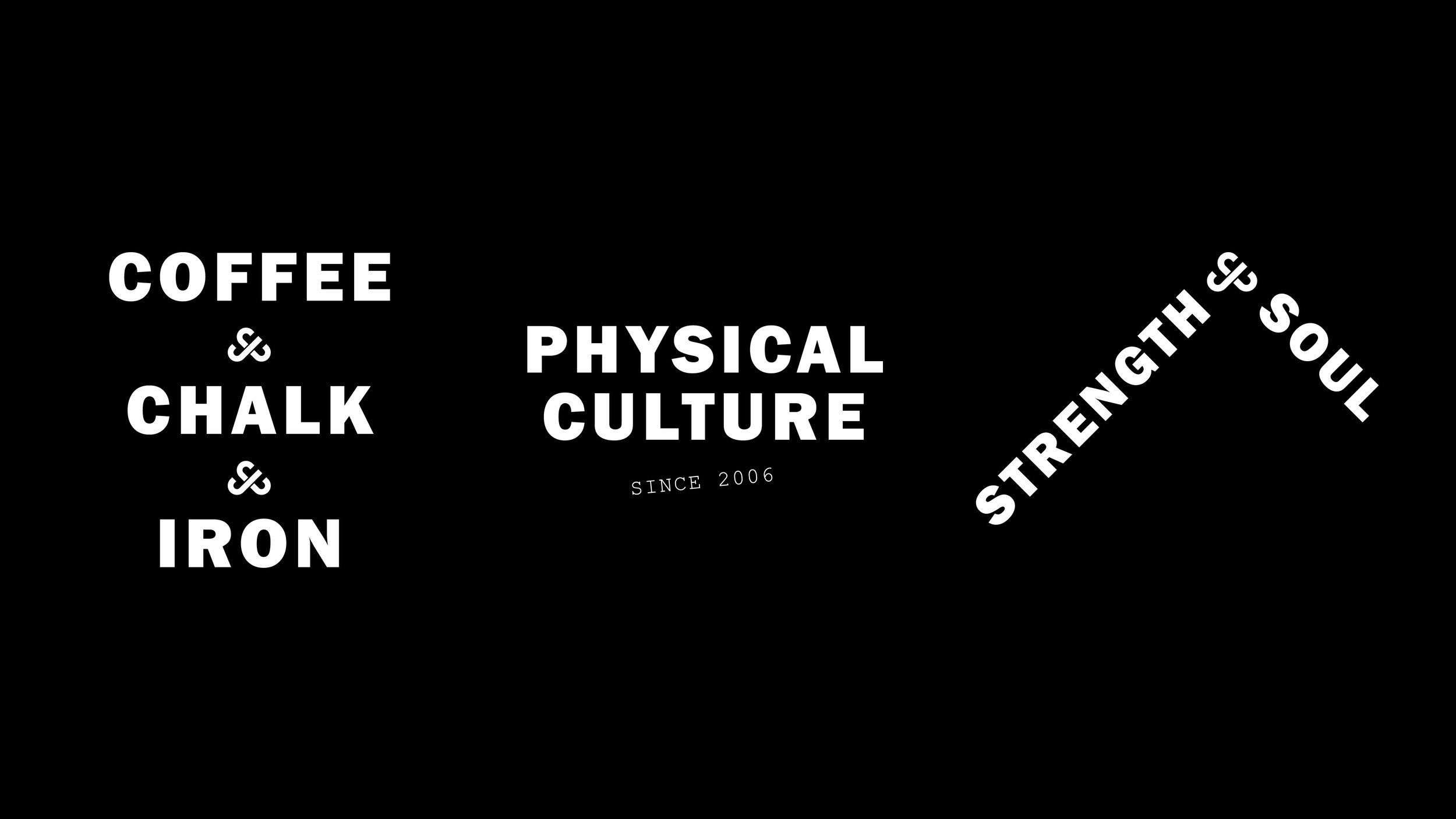
Interlinked ‘JC’ initials form the brand’s monogram, and chain and ironmongery metaphors run right through the tone of voice. Across the site, merch, and posters we used raw black and white photography and an alternative illustration style. And to nail the grunge aesthetic, for typography we took inspiration from 70s punk posters and weight plate lettering. It’s strength training, with a stroke of Black Flag.
“It has been a pleasure to work with Lark. My branding and website was in need of a revamp and they delivered beyond my expectations. Everything was delivered in a timely and professional manner. As a client I felt that Lark really understood what I was wanting to convey with my business, I would highly recommend their services.”
James Coutts
Owner, JCStrength
Services
– Refreshed brand identity
– Website design & build
– Apparel design
– On-going consultation

