Our process – getting behind the scenes of a visual identity project
Chatting with a potential client recently we got onto the subject of our process. Our visual identity projects follow a set plan from research to creative concepts, design development to artwork and delivery. Like most design studios, our ‘work’ page only features the final stage of our process and shows the finished, polished designs we’ve Photoshopped and photographed from the best angles. So, to break that trend (and mix some metaphors), we thought it would be fun to take a look behind the curtain and see the ‘nuts and bolts’ of how we work.
With scribbles and notes, half-ideas and half-finished visuals, these projects take time and energy to perfect and get ‘just right’. With this in mind, we’ve taken a look back over the creative concepts stage of our project for Notting Hill-based estate agents, Homesite.
The previous visual identity didn’t feel premium enough for their new audience.
The Brief
Homesite have been in Notting Hill for years you just wouldn’t know it. Tucked away in a little mews street they’ve been steadily helping people buy, let and sell properties all over West London. But, having secured a plush new spot on Westbourne Grove, they wanted to refresh their brand identity to fit their new upmarket address and showcase everything that makes them unique.
Flanked by boutique shops, established eateries and keen to attract passing trade, Homesite needed to look more like their surrounding shopfronts. From the initial kick-off meeting, this quote stood out as an encapsulation of Homesite.
“We have a passion for Notting Hill, our community, and local surroundings… We know the properties, streets, schools, and local businesses. We have built relations across W11, W2 and W8 and are part of the community within which we work.”
We distilled the brand idea down into two words.
Option 1
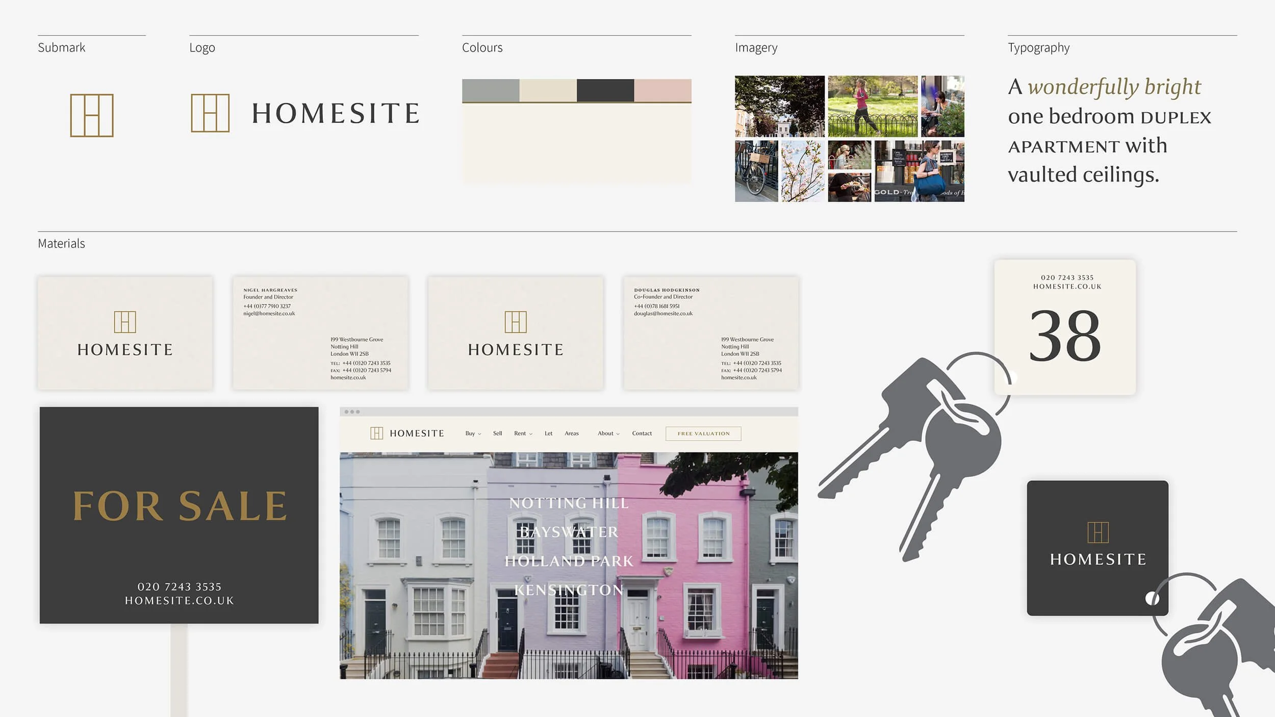
The first route was based around the concept of ‘hidden local knowledge’. Homesite are able to tell potential buyers where the nearest tube, rail links and schools are. But they also know what time the last pastel de nata runs out at Lisboa Patisserie or what the guest ale is at Cock and Bottle around the corner. Through living and working in the area for many years, they know what’s behind those famous pastel façades.
A ‘hidden house’ logotype.
Visual identity overview.
Option 2
The second route was inspired by research into the local area. Some digging unearthed the fact that Notting Hill is the home of London brick. In the 19th Century, potteries and brickfields were established in the area. A brickwork-inspired logo and associated colour palette married the history of the area with it’s present contemporary feel. Homesite’s ‘foundations in Notting Hill’.
Local research imagery.
A brickwork-inspired symbol.
Visual identity overview.
Option 3
The third and final route centres on Homesite’s office pooch Phil, making him a mascot for the business and an embodiment of their ‘local loyalty’.
A loyal local who’s walked the streets of Notting Hill for years…
…And a typeface from those streets.
The combined logo.
Visual identity overview.
The decision
After much deliberation, route 1 won out overall. The logotype and colour palette was refined and a bespoke map and associated icons were added to the identity assets. You can see the finished case study here. We’ve continued working with Homesite to evolve their identity including designing their seasonal window displays and are currently working on a new ‘love local’ marketing campaign. More to follow very soon.
Recent news


