What can Lego teach about reconfiguring and rejuvenating existing branding?
My four year old loves Lego. Well, that’s not strictly true, I love Lego and he, by proxy now loves it too. We have two modes of building together, the one where I find the bits and watch as he pieces them together and the one where we ‘make things up from our imagination’. Here we often create ‘inventions’ from the surprising collection of Lego sets he’s managed to collect in his short time on this planet. Recently though, a third option was revealed.
The creative boffins at Lego have created a number of 3-in-1 sets. Each set has a selection of pieces and a theme with instructions for three different models to be constructed, dismantled and then rebuilt into the next. It must have taken the creative team a long time to work out the piece that makes the giant robot’s thrusters could be reconfigured to form the wings and tail of a spaceship.
A Lego Creator 3-in-1 set.
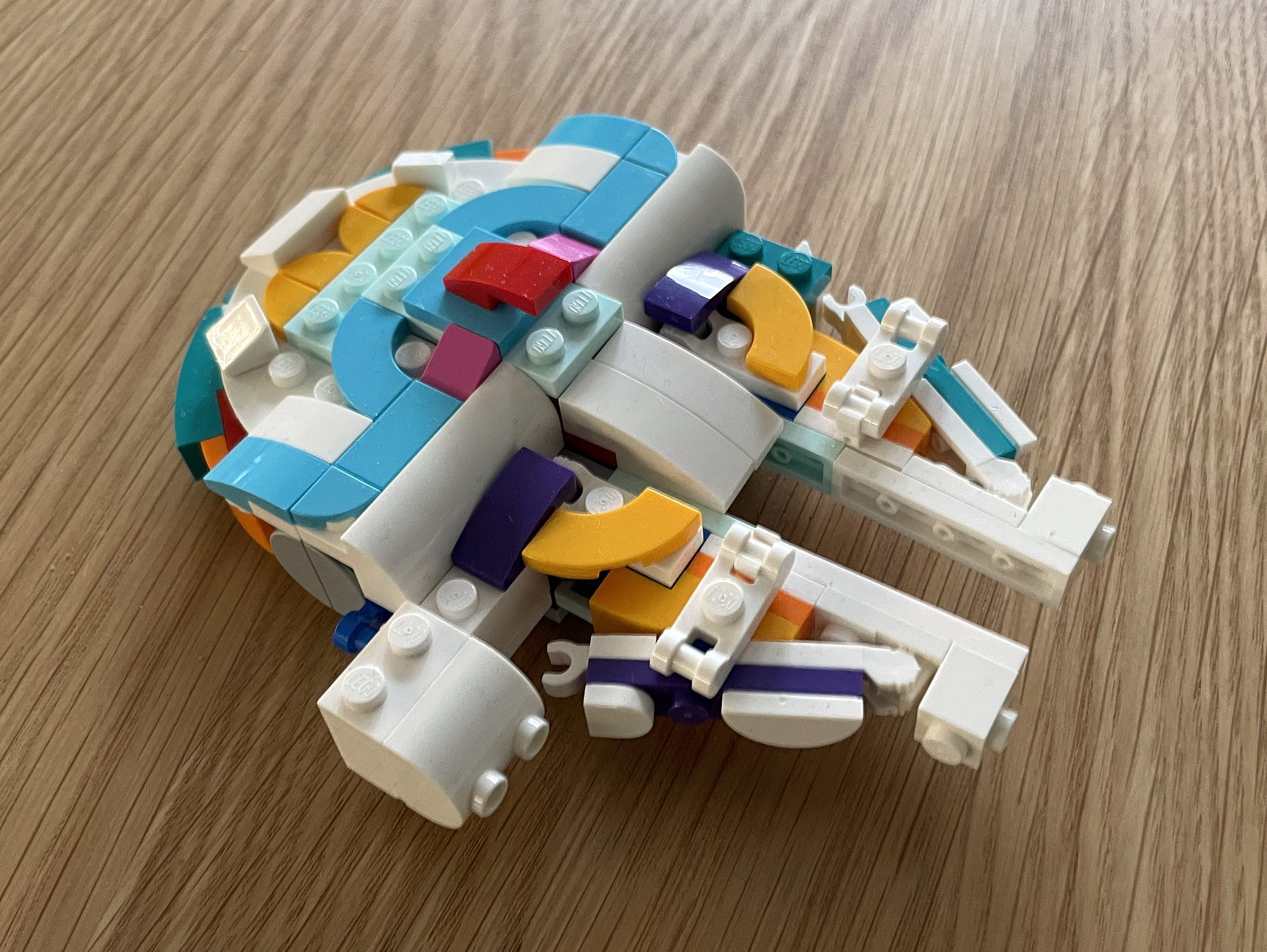
This new way of looking at Lego sets led me down an internet rabbit hole into a whole community of creators who reinterpret existing Lego kits into custom designs. Rebrickable is a website where you can search for the kits you have, look up all of the creations that have been dreamed up by enthusiasts and download instructions for a small fee. Sure enough, one of the unicorn 3-in-1 sets we have has been hacked and reconfigured into a miniature, pastel-shaded version of the Millennium Falcon. A far cry from the mythical creatures that the blocks were intended to create.
A pleasing pastel unicorn…
…reconfigured into the fastest hunk of junk in the galaxy.
Fresh thinking can bring a new approach
This reconfiguring, constructing and rebuilding reminded me of some of the projects completed in the studio over the past year. As well as defining new brands, 2023 was a year of developing existing ones. Whether it’s connecting with a new audience or reinvigorating an existing one, taking the elements of a well-worn brand identity and reconfiguring them (along with adding in a couple of new pieces) can be a cost effective way to change things up without throwing everything out and rebranding from scratch. Taking a step back to consider the potential of what you’ve already got – rather than turning to something new – can create something fresh and different.
Simplifying, selecting and signposting
The University of Oxford Alumni team have a well defined brand with guidelines and a good collection of assets. However when the branding was first developed it was aimed at an older audience and was more in line with the university’s core branding, look and feel. As the alumni team has developed their messaging, they realised they were failing to engage their younger ‘new alumni’ who felt that the more traditional tone of communications didn’t connect with them.
After performing an audit on their existing materials and working with the alumni team to develop new messaging, we cherry picked and simplified existing brand assets and created new ones more in keeping with a younger audience. We elevated the bright, underused secondary colour palette to feature more prominently and simplified the logo to a single colour.
We used existing photography guidelines for student portraits, introduced a suite of bespoke icons to help with signposting and elevated the secondary fonts for more bold messaging. The overall look of the materials still felt like it belonged to the university but had a more dynamic, modern twist for at a younger, more digital-first audience.
A fresh, bright identity that still followed the core guidelines.
Bold, simple messaging with student portraits.
A new range of icons added to the suite of brand identity assets.
Extending existing assets and introducing something new
When the Learning and Development department of Ordnance Survey were faced with rolling out a new company-wide programme, they wanted to build on the existing OS brand to create something that would engage employees and show off their values and culture. The existing Learning and Development materials were well designed, clear, and consistent. But for internal audiences, they felt a bit cold. There was nothing to distinguish them from external messaging, which meant they sometimes went unnoticed by staff.
We introduced bespoke patterns inspired by OS map keys, a range of people-centric illustrations all created in the OS colour palette and used their existing icon style guide to create a new suite of learning-focused pictograms. We worked closely with the brand team to ensure the work was on brand and still recognisably OS but with enough stand out to engage an internal audience.
People-focused illustrations using the OS brand colour palette.
Learning and Development materials.
More specific learning-based icons.
Things to consider
If you’re looking to engage a new audience or rejuvenate an existing one, before you throw out your brand guidelines and go with that off-brand snazzy Canva template, take a moment to see if what you’ve already got could be deconstructed and rebuilt into something new. Take an audit of what you’ve got (and what’s missing). Consider your audience and potential messaging and see if you already have all the pieces. Or, if existing assets are exhausted, be prepared to introduce something new.
If you’re struggling to connect your brand with your audience or need help with constructing something new, get in touch.
Author: Keith Hancox / Founder


