Conversation Space
A chatty brand identity that captures the power of conversation

People in the City aren’t having enough proper, human conversations. That’s the concept at the heart of Conversation Space. The company shows people how to talk better, helping them to get more out of reviews, feedback, meetings, and mentoring. With their old branding looking a little tired, they asked us to come up with an identity that would express what they do and capture their conversational wisdom.
Thinking
We held a strategy workshop to establish the purpose, vision, and mission of Conversation Space. That’s our way of drilling down to the heart of what makes a brand special. We helped them work out the what, how, and why behind their brand, then used it to come with a core idea: the power of conversation.
Next, we looked at how to convey that core concept visually and verbally, and thought about what ‘the power of conversation’ really meant for clients. When people work with Conversation Space, they learn how to communicate more simply, with confidence and humanity. So, we wanted the design and tone of voice to reflect that too.
Outcome
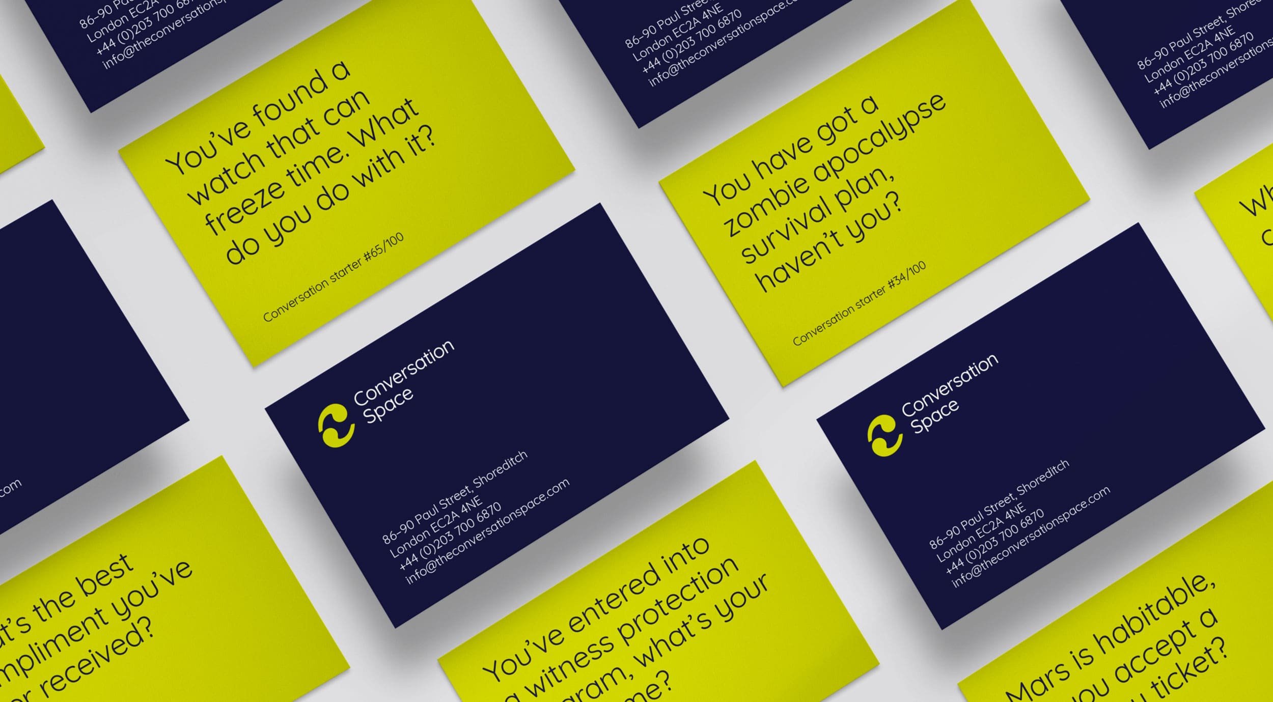
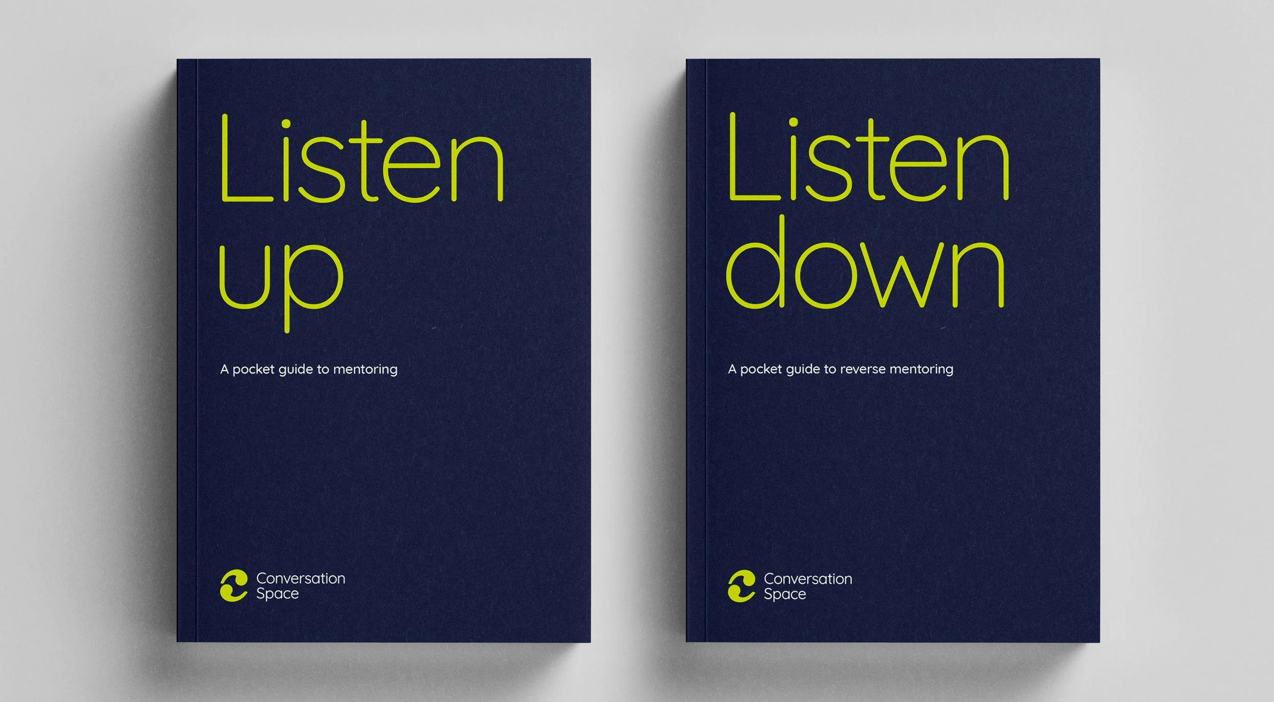
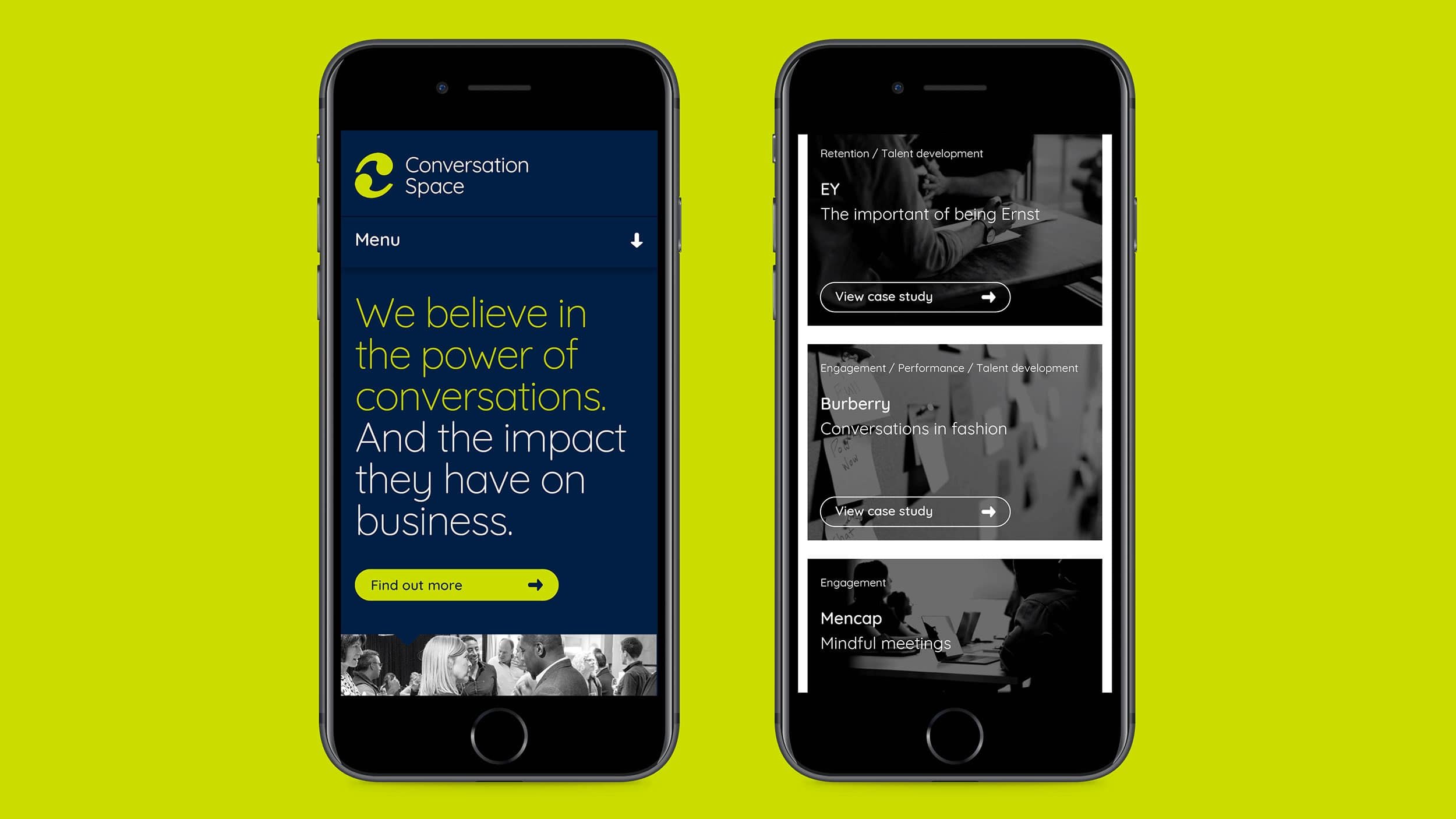
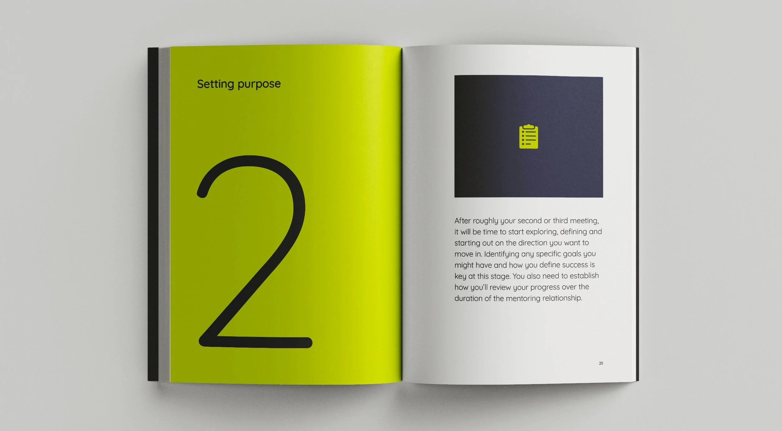
Conversation Space now looks confident and authoritative, with a smart and stripped-back brand. But to show the company’s focus on humanity and personality, we underpinned the visual identity with a slightly cheeky tone of voice. All that’s captured in a detailed set of guidelines covering everything from logo placement and tone to imagery style and colours. And to help the brand start conversations of their own, we designed business cards printed with light-hearted prompts. Just like Conversation Space, they’re designed to get people talking.


“Lark provided inspiration, creativity and exquisite skill in crafting and developing our new brand. By combining challenge and ideas, asking critical questions and expertly guiding us through a thought process, Lark have helped us hone our message and create an identity that truly reflects our place in the market.”
“We value the relationship that Lark has built with us – they get us, know what we’re about, and are able to help us translate our offering through all the different routes to our clients. To have their unique expertise playing a key part in our future business development is tremendously exciting and has already provided tangible value.”
Sara Hope and Emily Cosgrove
Co-founders, Conversation Space
Services
– Research
– Competitor audit
– Strategy workshop
– Brand personality and positioning
– Refreshed brand identity
– Brand identity guidelines
– Tone of voice
– Website design & build
– Brochure design
– On-going consultation
Collaborators
– Website build: Forty Eight Point One
– Print: WithPrint


