Rico Coco
A traditional rotisserie brand with a modern French twist
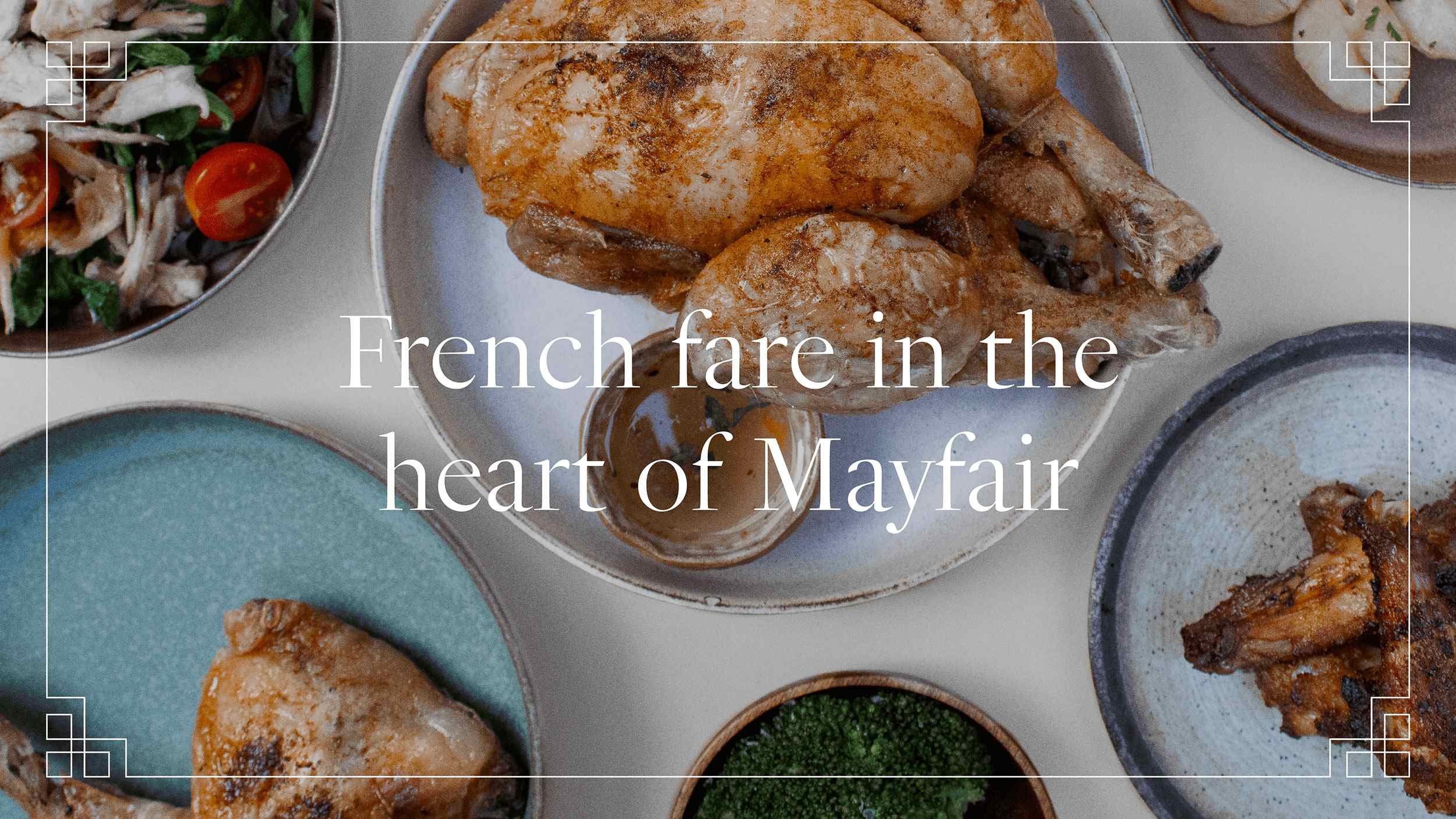
French cockerels don’t cock-a-doodle-do. They cocorico. The name for this Mayfair rooftop rotisserie flips the familiar sound back to front, and that’s not the only thing turned on its head. In Rico Coco’s visual identity, we’ve given français a fresh, modern twist, swapping posh and stuffy for vibrant and buzzy.
Thinking
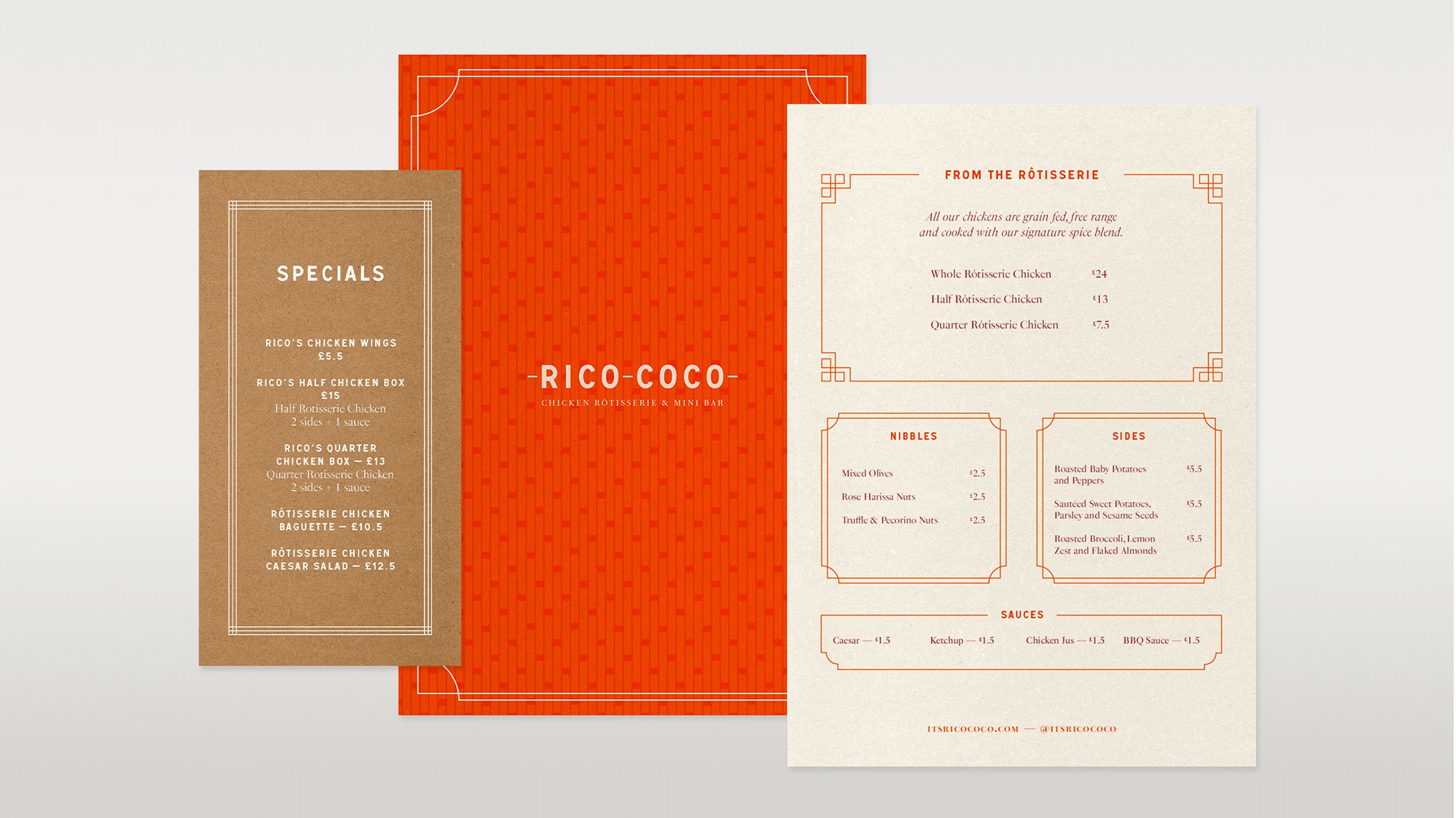
The menu at Rico Coco is inspired by French food, but stripped back. Think traditional rotisserie chicken with a side and a selection of sauces, plus a few cocktails. Less fancy French dining, more gathering around a table to eat and drink. That gave us room to create something playful, but minimal, drawing from the best bits of French design.
Outcome
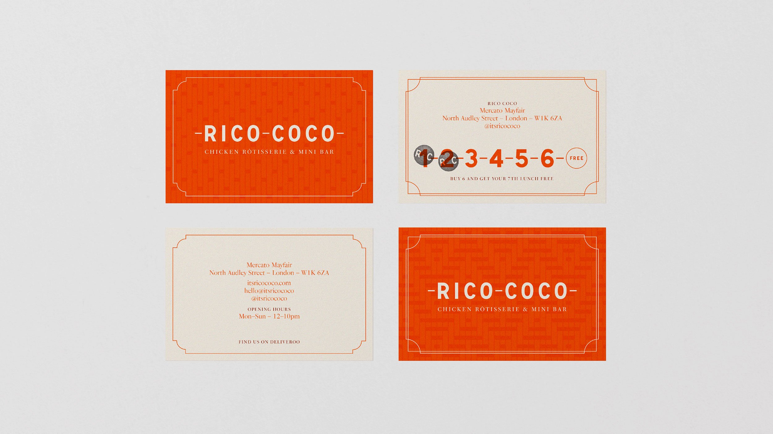
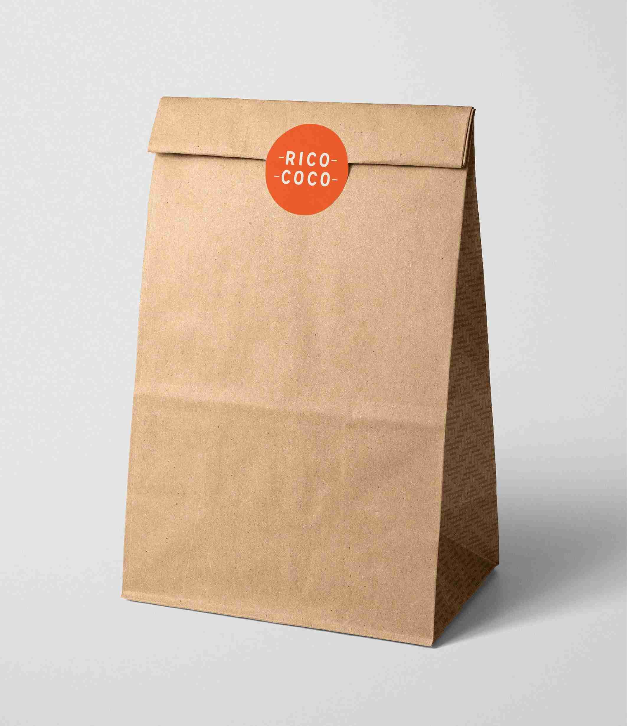
We started with the logo, literally skewering the letters and animating a slow rotisserie turn. Then the fonts. Both Signal and PS Fournier are nods to Rico Coco’s European heritage, taken straight from the streets of France. So is the colour palette – the poppy orange and off-white are inspired by the iconic French tabac.
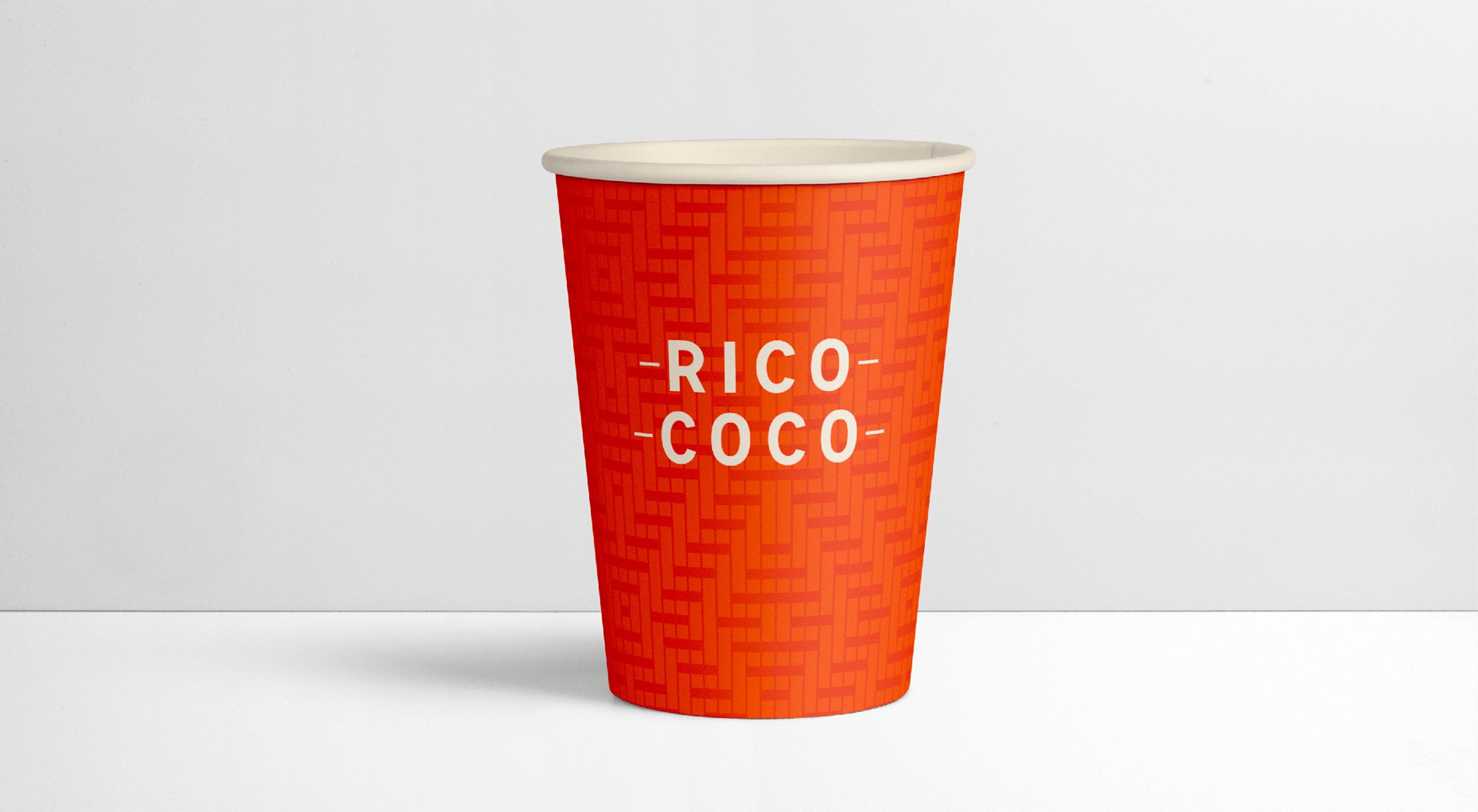
The patterns riff on Maison Gatti’s Parisian café chairs, while the borders come from menu boards and brasserie signs. And for social, we added quirky vintage photography with a touch of avant-garde. It’s all fresh, fun, and French at heart. Just like the food.
Services
– Visual identity
– Branded materials
Collaborators
– Animation: James Robertson


