The Fly
An action-packed brand for England’s new national lacrosse league
Ever caught a quick game of lacrosse? That’s about to change. England Lacrosse asked us to create the name, tone of voice, visual identity and launch graphics for their new national league. It’ll be the first formal league in the world to play a fast and ferocious 6-a-side format that’s heading for the Olympics. And it’s taking off in 3, 2, 1...
Thinking
This brand would be a chance to find a new voice and identity for the sport, freshening up its image for a new generation of fans. It had to appeal to an 18 to 30-year-old audience without putting off those who already loved lacrosse. It needed to celebrate everything that’s great about the sport, but make it clear this was something new and exciting. And it had to challenge some of the big misconceptions about lacrosse. It’s not a ‘posh girl’s sport’. It’s the next big thing.

Outcome
We started with the name, exploring three areas of the proposition: movement, speed, and air. We wanted something modern and punchy that captured the differentiators of the sport. And once we hit on ‘The Fly’, we had lift off.
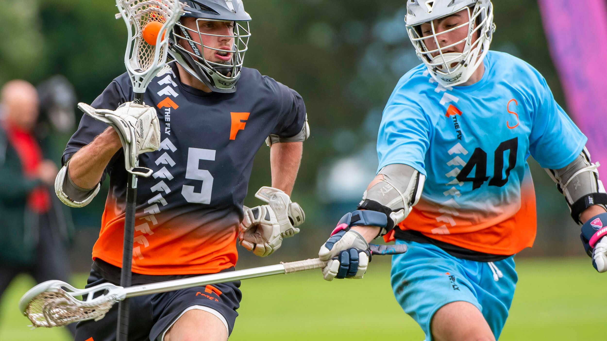
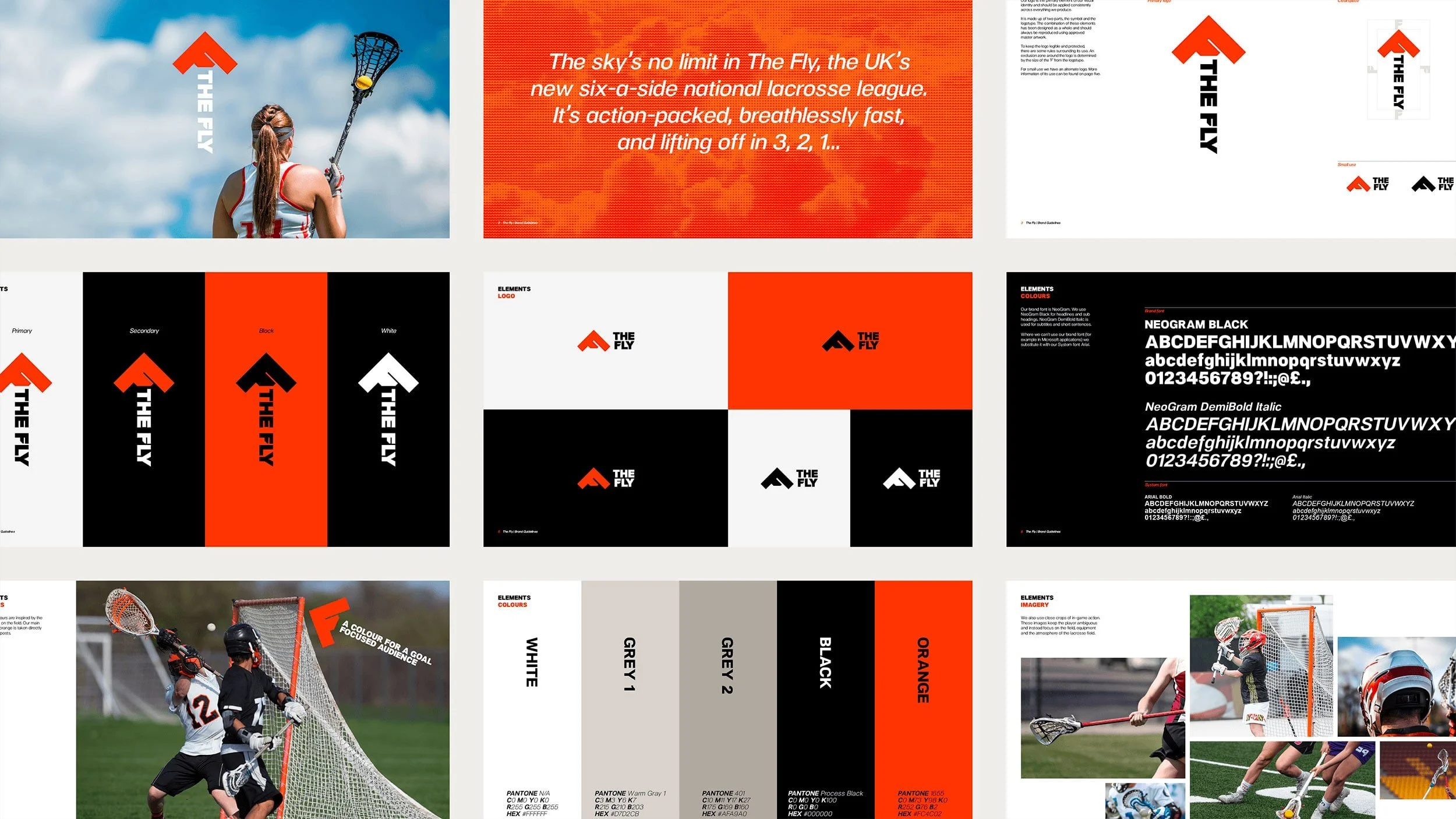
On the back of the name, the league’s new brand identity never stops moving. Photography catches air with dramatic, sky-filled shots and high-flying, motion-blurred action, and the arrow logo invites everyone to look up. But the identity’s still rooted in the sport; that fiery orange comes straight from the lacrosse field goal.
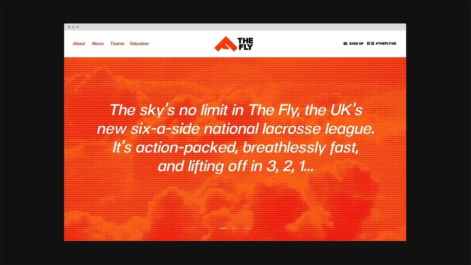
Supporting language also has its eye on the sky. Verb-led ‘up’ phrases and ambitious lines play on the literal and figurative meaning of ‘reaching higher’, reflecting the league’s elite talent — and their Olympic ambitions.
Rolled out across kit, social, advertising, and other platforms, our vibrant new brand identity will help lacrosse reach new heights.
“Coming in with a full brand creation project, Lark were able to ask the right questions and take our early thoughts and ideas and translate them into fully realised brand concepts that represented exactly what we were looking for. They clearly set out the process from start to finish, kept us engaged throughout each stage, and helped us to present the new brand to our wider organisation.”
“Working with a smaller agency made us feel valued as clients and they were always on hand to answer questions or respond to any challenges quickly and professionally, ensuring we were all set for our successful brand launch.”
Sean White
Marketing & Communications Coordinator, England Lacrosse
Services
– Naming
– Tone of voice and messaging
– Brand personality and positioning
– Brand identity
– Social media graphics
– Brand launch materials
Collaborators
– Naming and copywriting: Yarn
– Event photography: Ady Kerry and Adam Scott


