Tick Tock Website
A colourful e-commerce website design for curious tea-drinkers

Tick Tock is an independent tea brand specialising in naturally caffeine-free rooibos. They’ve spent more than a hundred years perfecting their blends, and you’ll spot their latest colourful packaging on the shelves of most decent supermarkets. Now, thanks to us, they have a vibrant new e-commerce website to match.
Thinking
Nobody knows Tick Tock’s visual identity like we do; we’ve worked with them for a while. So with new products and packaging ready to launch, they asked us to rethink their website to fit.
Their packaging blends formal, carefully structured design with rich colours and illustrations. And over on social media, they’ve established a warm and spontaneous personality that connects with customers old and new. The website needed to bring those two sides together. It had to be colourful but considered. Vibrant, without losing the brand’s long heritage. Fun, while evidently knowledgeable. And while it had to look the part, it had to do the job too.
Outcome
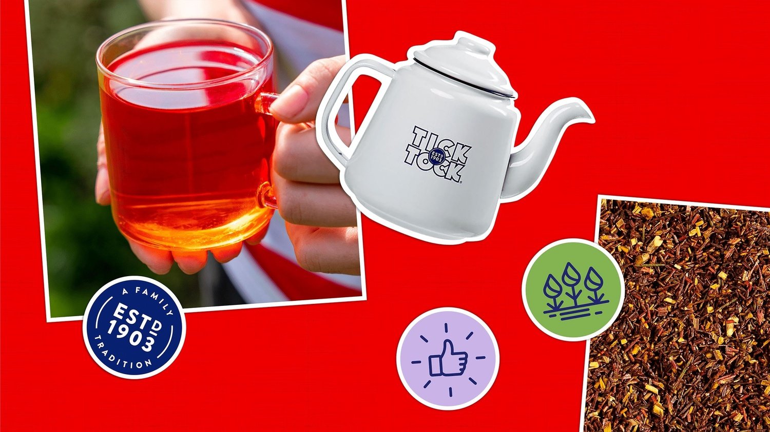
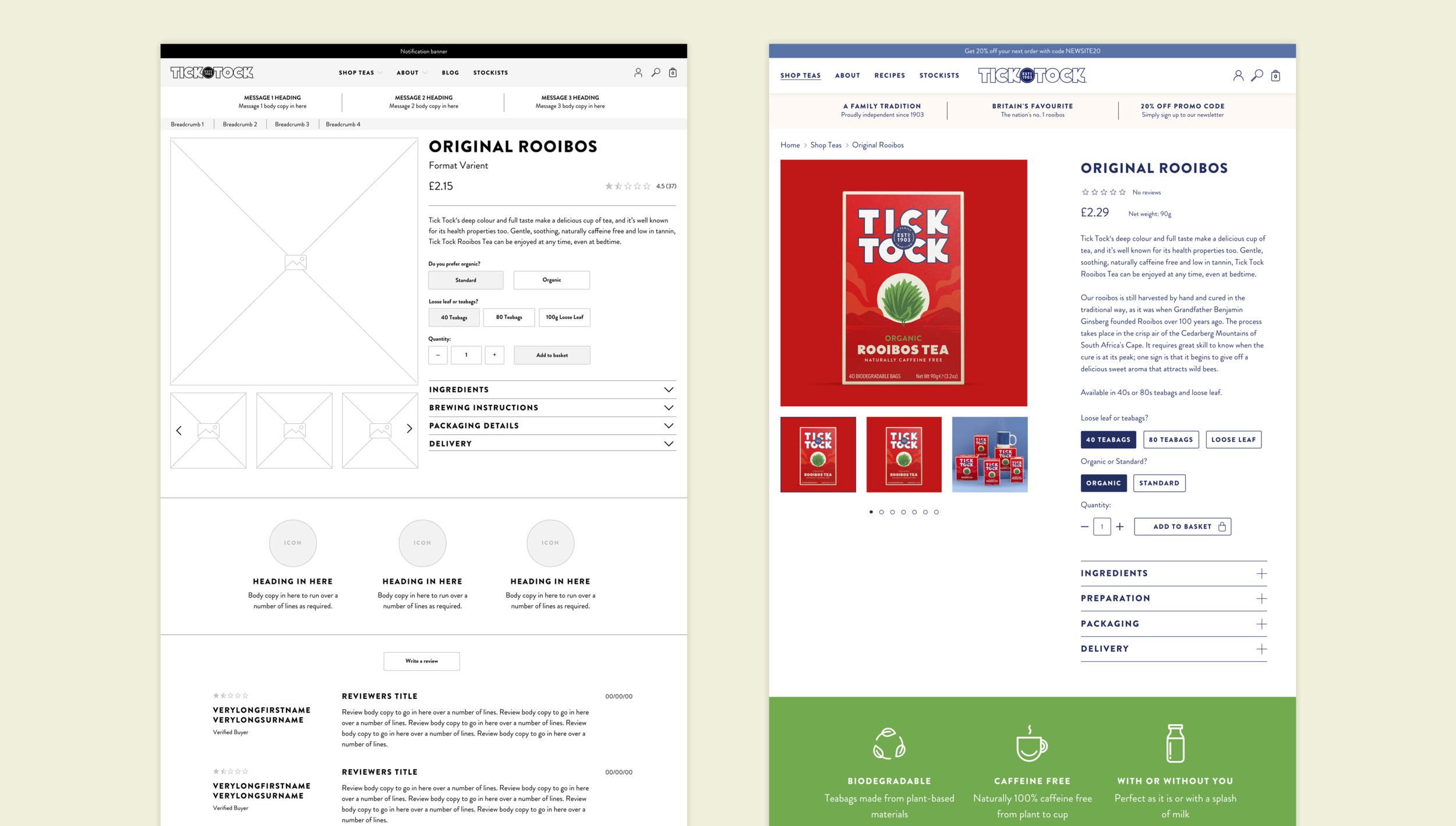
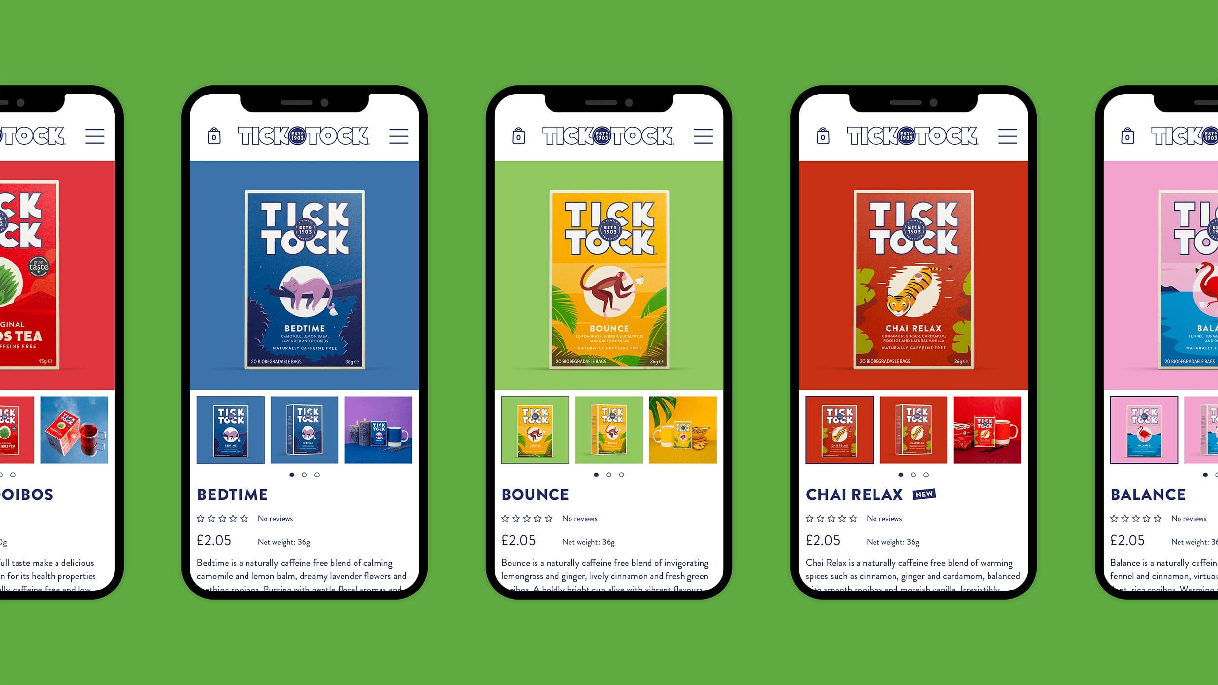
We started by site-mapping, wireframing, and planning the user journey of the site. Then we introduced the new visual language. It’s rooted in the concept of a travel journal or scrapbook, building on the brand’s existing identity and inviting users to discover the world of Tick Tock.
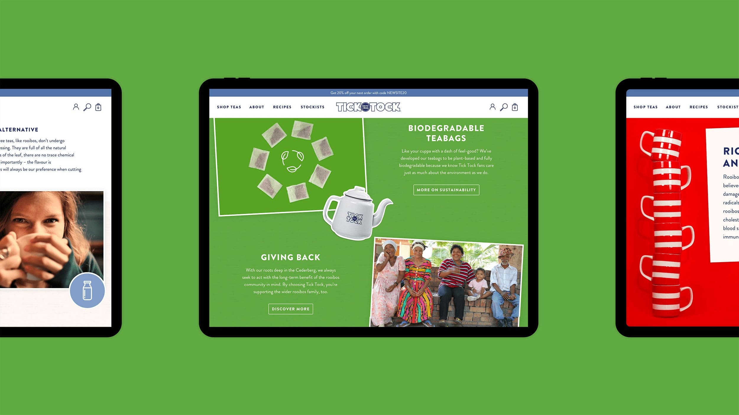
The ultimate design is fun and colourful but not in-your-face bright, with subtle animations that enhance the user experience without being flashy or distracting. The site itself is built in Shopify and fully customisable, so Tick Tock have complete control — they can change text, move stickers, change colours, and even tweak the angles of the images.
Altogether, the new e-commerce website shows off Tick Tock’s quirky personality without missing the heritage or provenance. Mission complete — time for a tea break.
“When it came to re-designing our website, we needed someone who would understand the challenge of showcasing a brand with heritage in a digital space. Maintaining the brand’s gravitas whilst being playful was a balancing act that Lark mustered beautifully. The result is a website bursting with personality, full of life and with user journey in mind. We couldn’t be happier!”
Nadia Morse
Marketing Director, Tea Times Trading
Services
– Website planning
– Sitemap and wireframing
– Website design
– Website build
Collaborators
– Website build: Twotwentyseven


