The Fly Teams
Giving four lacrosse teams their own unique identities

The first year of The Fly, a fast-paced national league by England Lacrosse, was all about getting word out. And it was a big hit. With the launch safely under their belts, the sporting body wanted to amp up the hype, level up the spectator experience, and drum up support for their players. That led them to their teams — and back to us.

Thinking
Supporters — and players — need teams they can get behind. And while we’d already named The Fly’s four league teams, the plan was always to flesh them out with a set of cohesive identities.
We discussed each team with England Lacrosse to learn what made them special, exploring everything from playing style and sportsmanship to any stand-out characters on the squad. Then we used all of that to write distinct team stories and language banks that still fit The Fly’s action-packed tone of voice. Those narratives provided the foundation for our designs.


Outcome
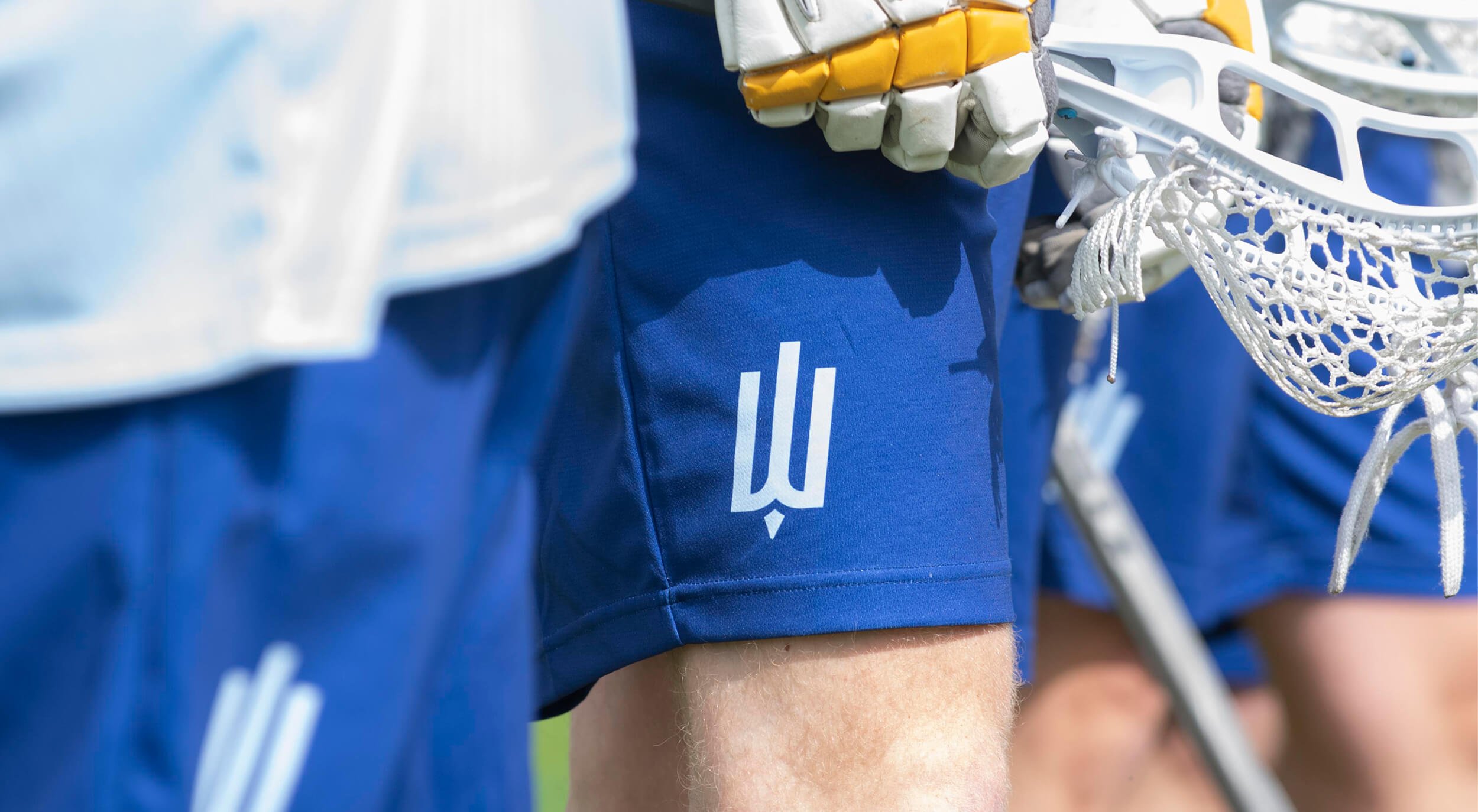
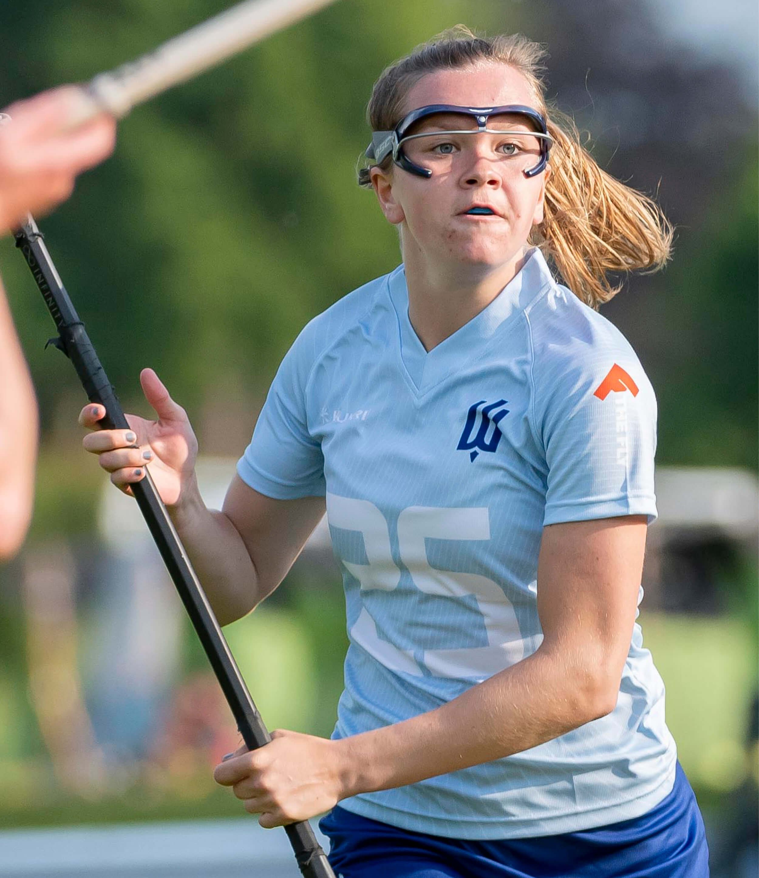
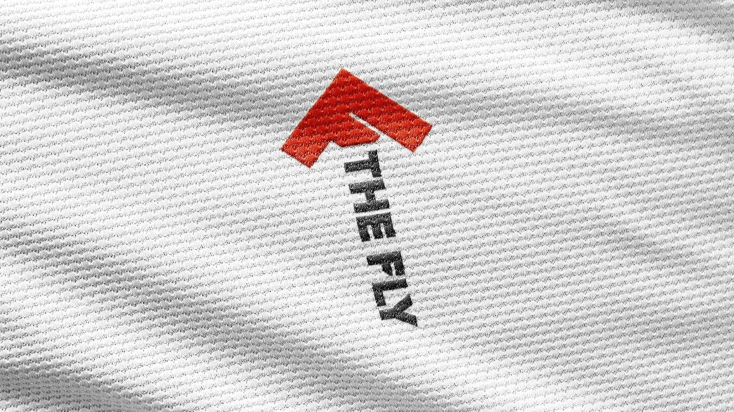
Using the stories as starting points we created a unique visual identity for each team, including a logo, colour palette, and ownable assets.
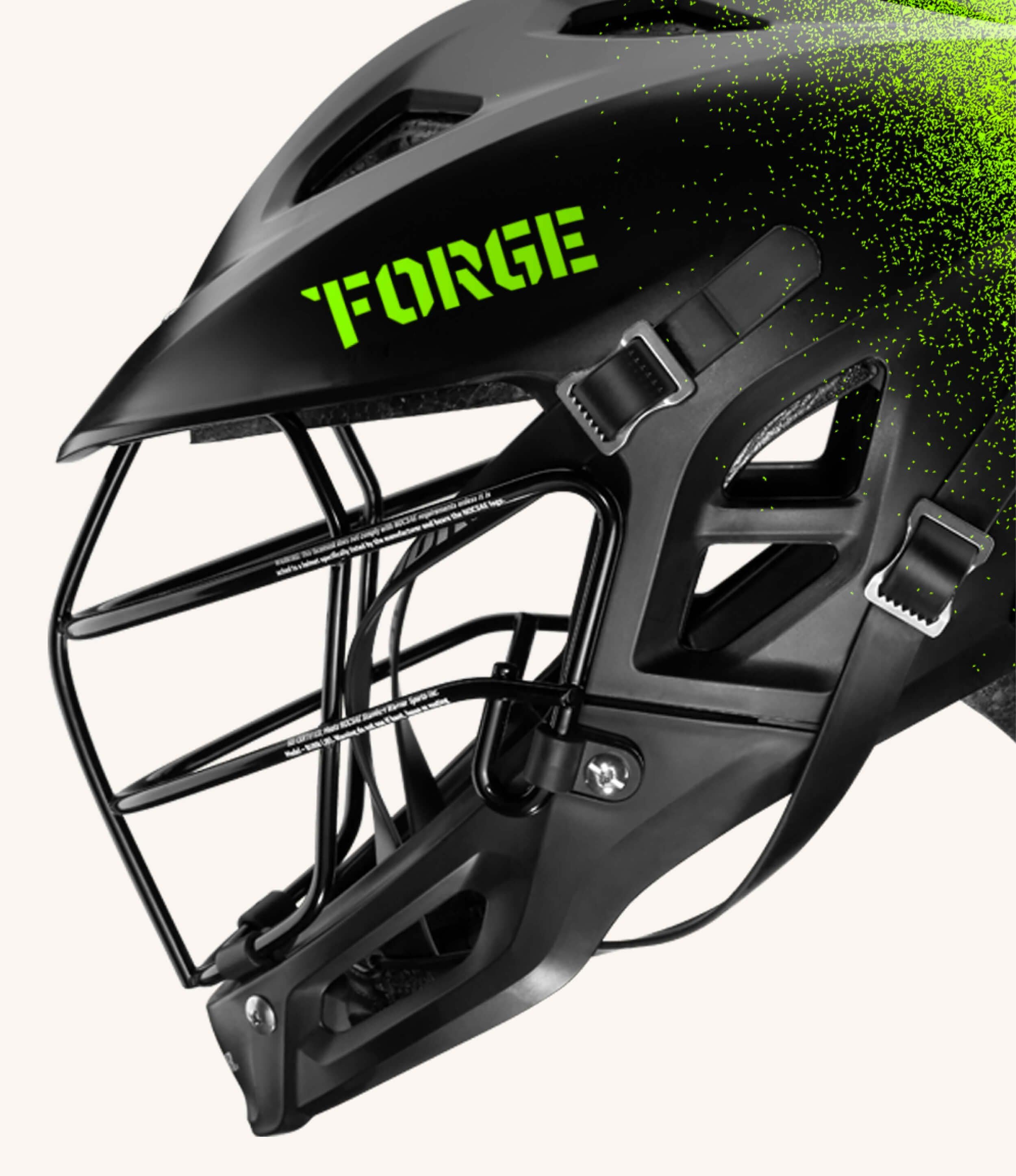
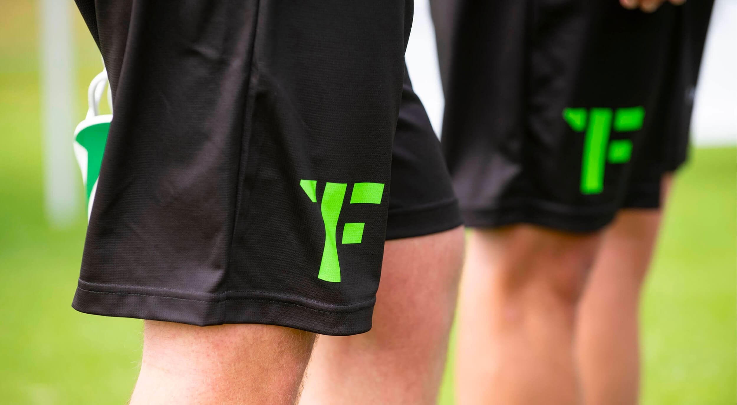
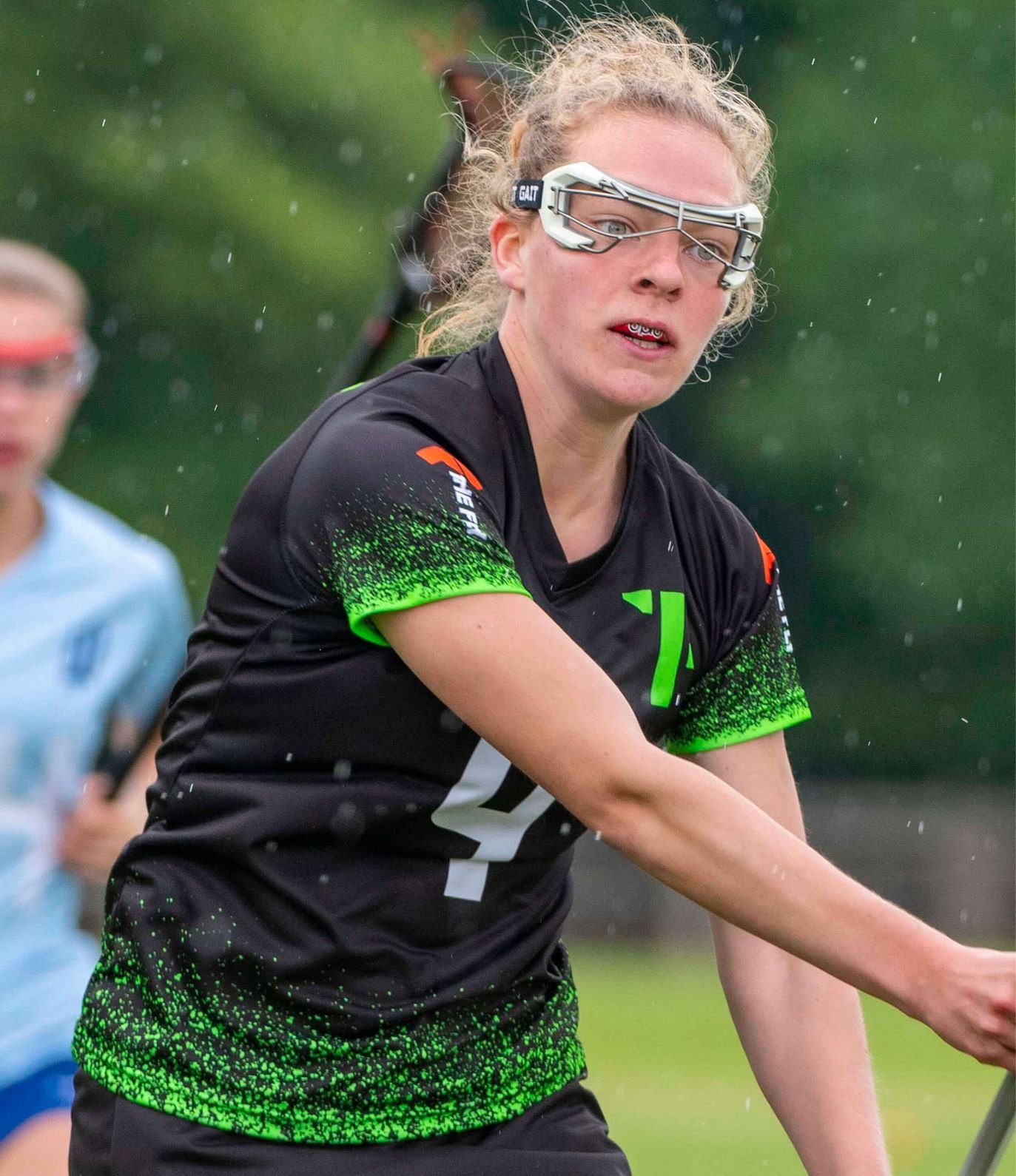
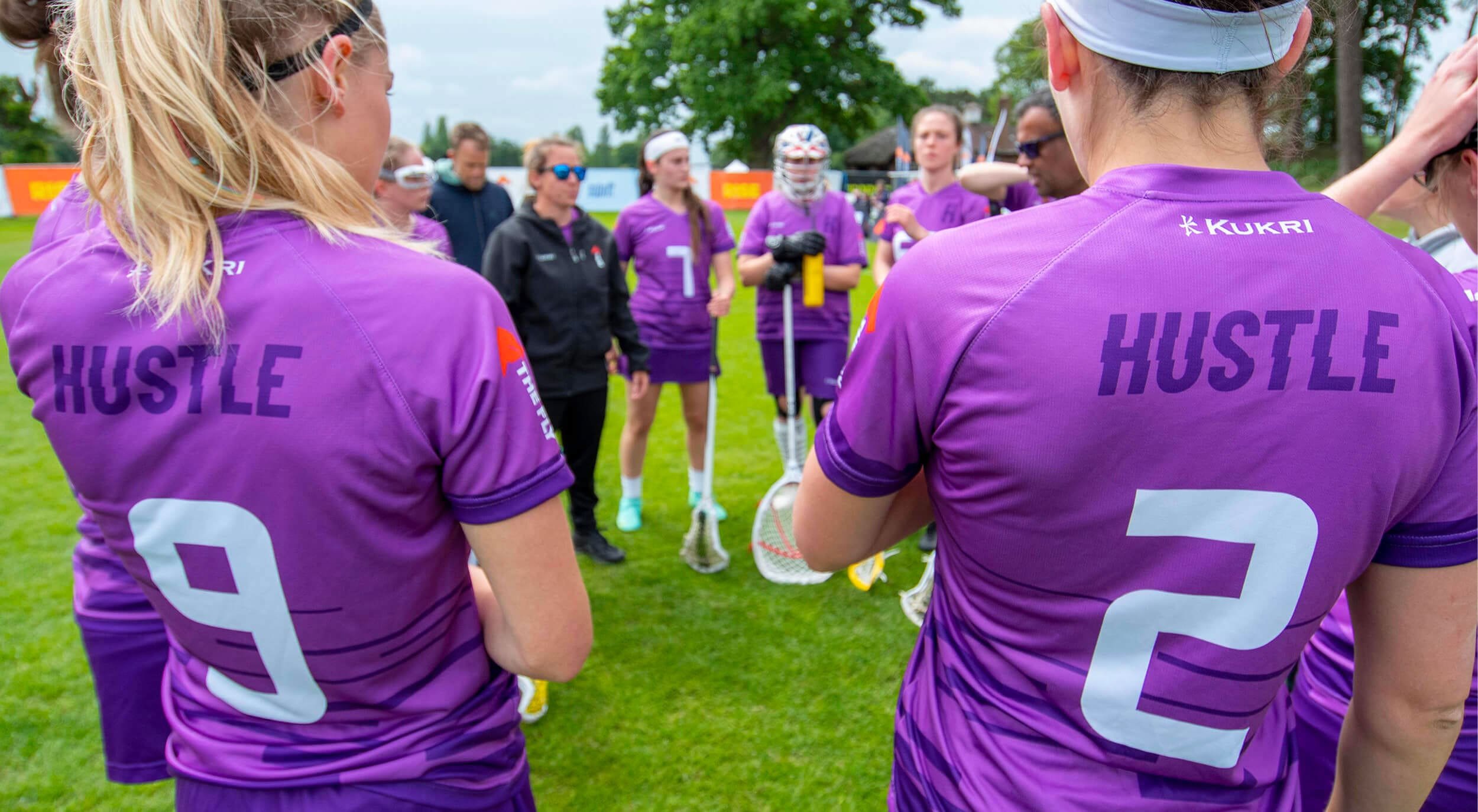
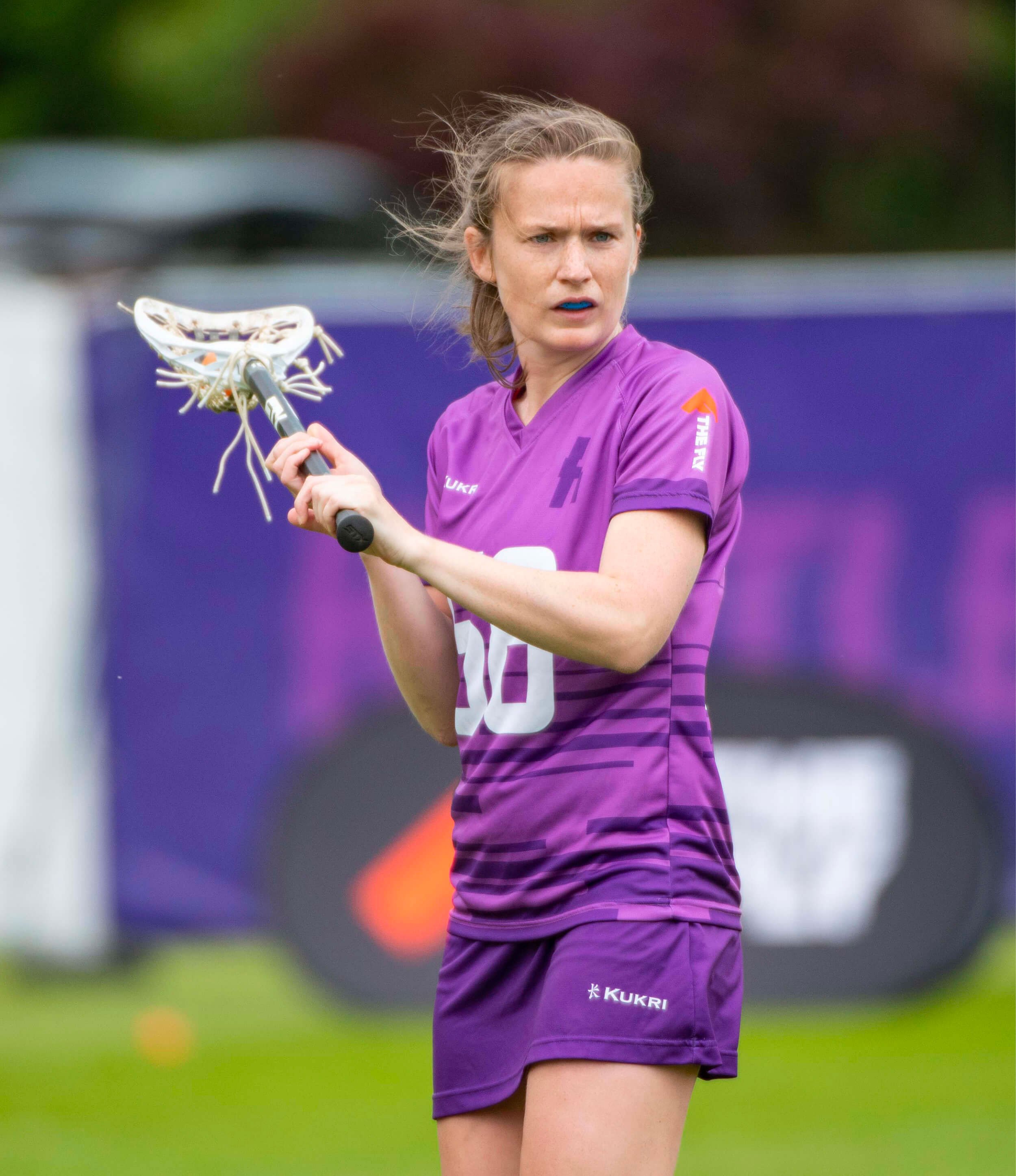
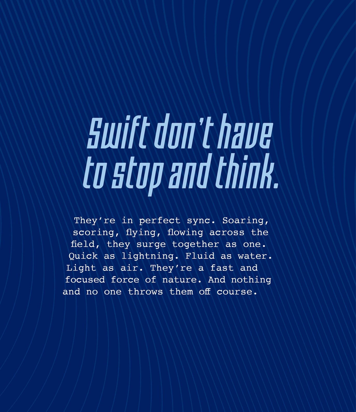
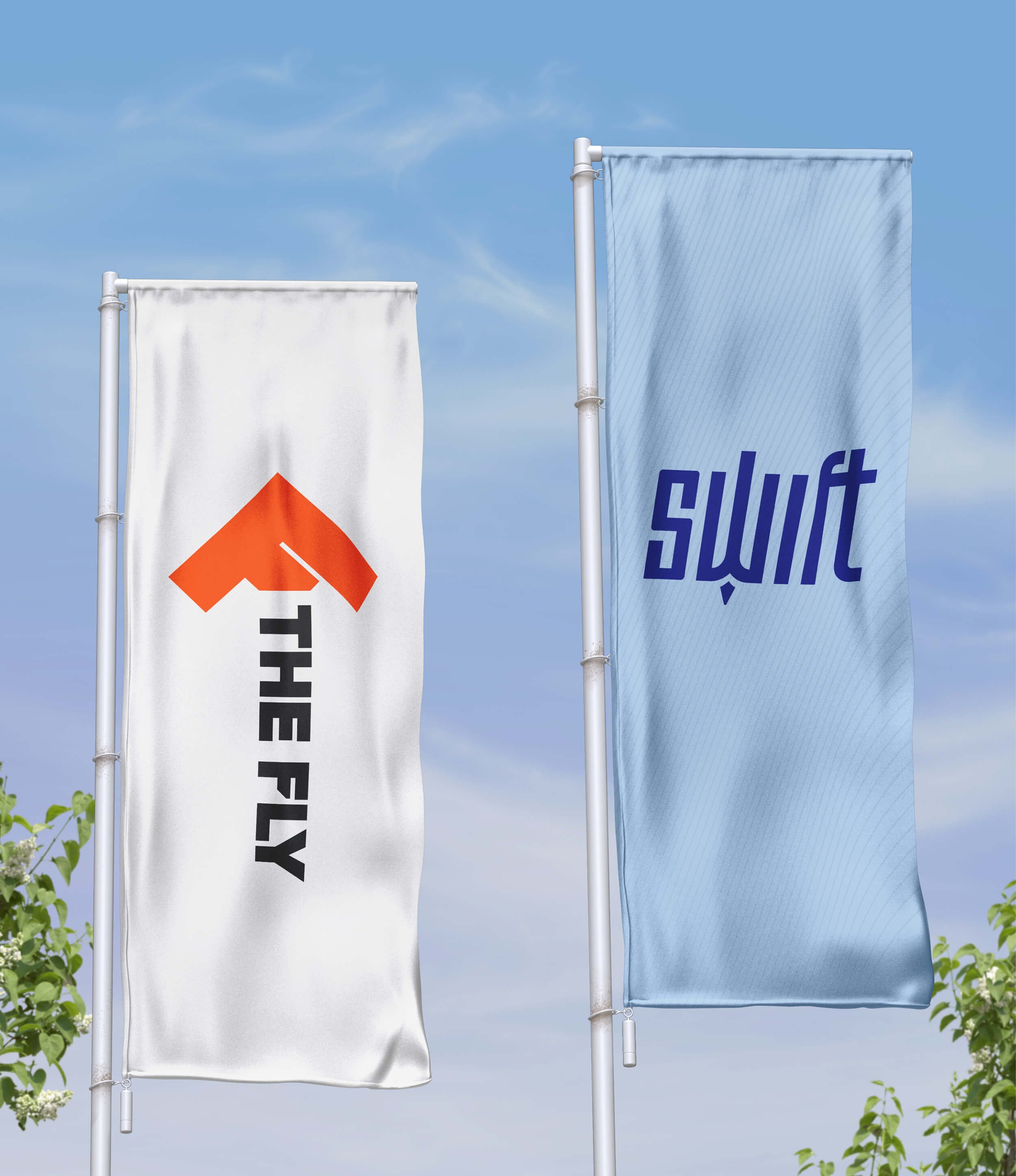
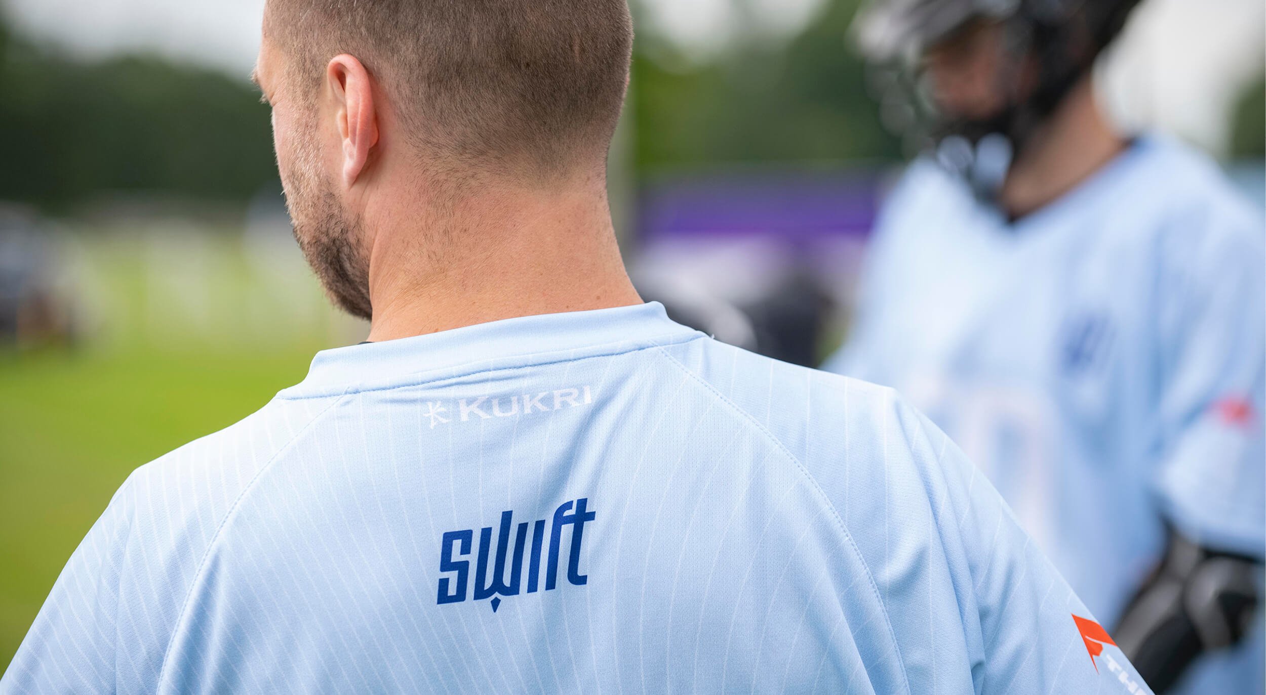
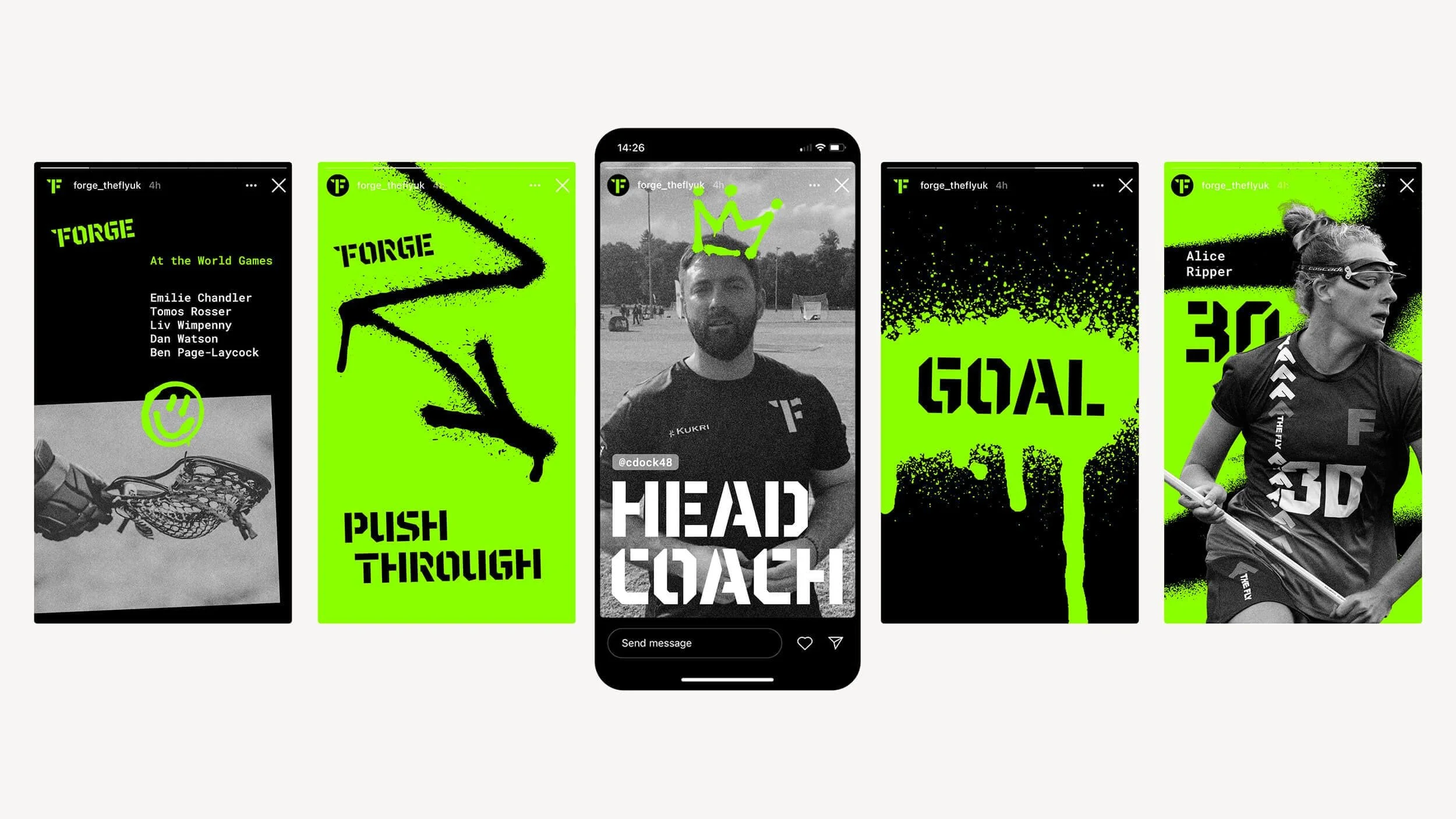
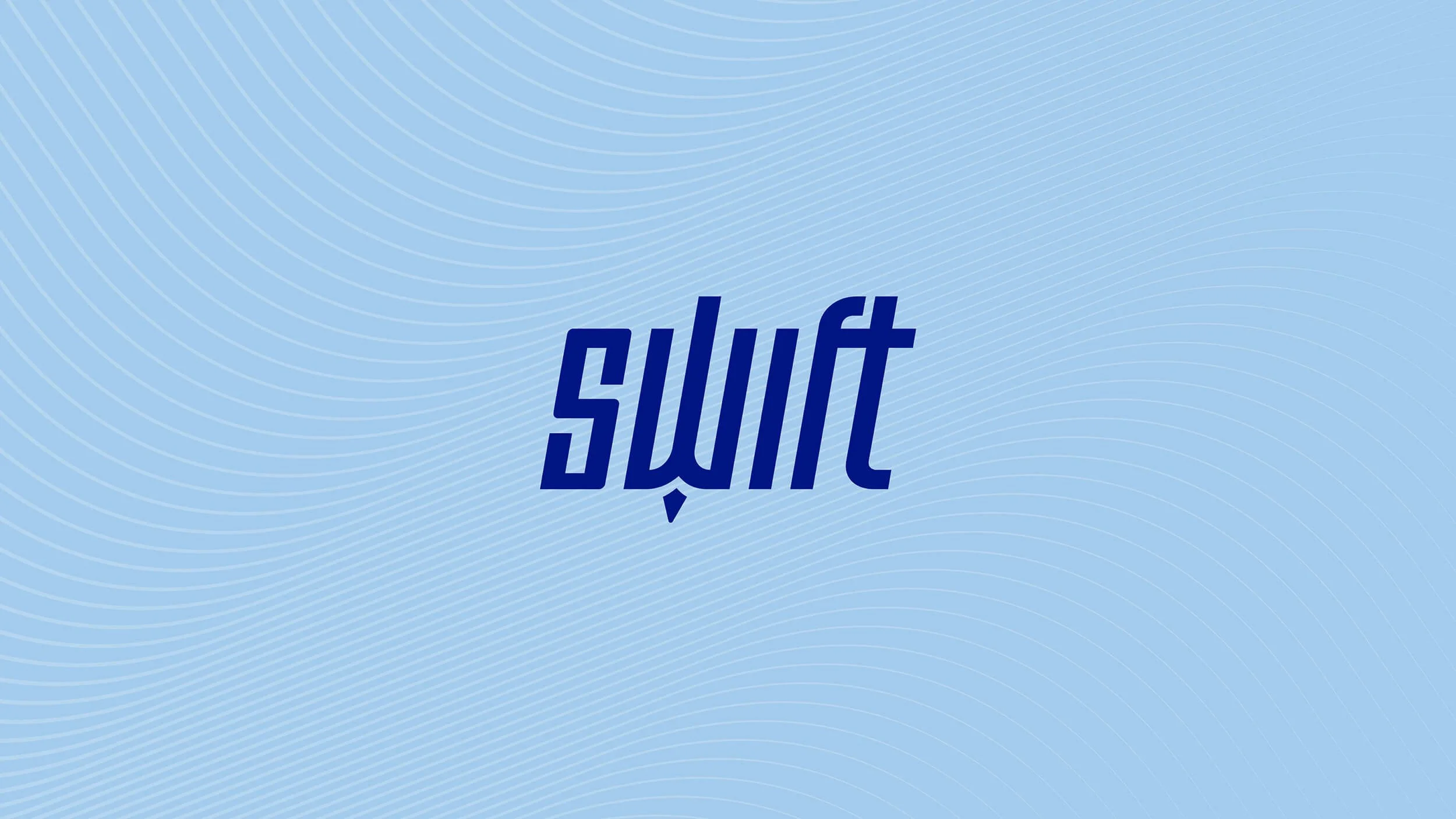
We brought out the defiance of Forge, the league’s renegades, with spray paint and photocopy-style graphics and an anvil-inspired logo. Upbeat Rise are bright and peppy with a hidden sun logo in optimistic yellow plus soft, sunrise-red gradients. We captured the non-stop motion of rapid-playing Hustle with a split logotype and iconography that always seem to be on the move. And for Swift, a team that’s always super synchronised and light on their feet, we took to the sky with a bird-inspired logo, an angled font to represent speed and flow, and waved patterns that ripple like the wind.
Now each team has its own identity while staying true to the feel of The Fly. Four teams, one league. Who will come out on top?

Services
– Naming
– Visual identity
– Verbal identity
– Social media graphics
– Brand launch materials
– Jersey designs
Collaborators
– Naming and copywriting: Yarn
– Logo stings: Fee Sheal
– Match photography: Adam Scott


