University of Oxford
A youthful rethink for a centuries-old institution
The University of Oxford is a world-renowned institution that produces around 13,000 sought-after graduates every year. But while Oxford is a globally recognised name, it was struggling to keep its new alumni interested. Research by the Alumni Relations Office showed their marketing just wasn’t ticking the boxes for Millenial and Gen Z leavers — leading to a lack of engagement with alumni services and gaps in their feedback about student life. Oxford needed to recapture alumni attention. So they came to us.

Thinking
The University wasn’t having trouble reaching their older alumni. It was the under-35s, made up of Millenial and Gen Z leavers, they were missing. So while the refreshed alumni brand had to have a modern, distinctive feel that stood out to younger graduates and hit all the right cues, it also couldn’t be too far removed from the existing identity.
Outcome
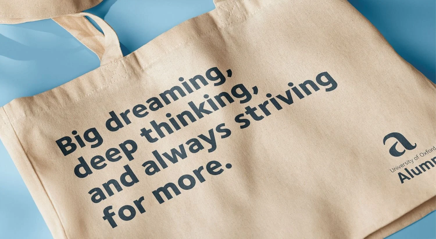
Whatever we did had to make an impact — without compromising the integrity of the University of Oxford brand. So we made the most of everything the brand already had, simplifying assets and building an alumni campaign around a strong core message. The result is fresh, uncluttered, and attention-grabbing. But still recognisably Oxford.

This was about subtle changes and updates, not reinvention. Take the logo: we simplified the existing asset by removing it from its tab device and making it all one colour. It’s immediately cleaner and bolder.

We used a bold new cut of Foundry Extrabold, a current UoO typeface, and blew it right up. Now, there’s room for attention-grabbing typographic routes and unmissable messages — and it’s still rooted in the core brand.
To make everything fresher and brighter, we shifted away from the usual blue and gold to work with a little-used tertiary colour palette from Oxford’s existing guidelines.

And we looked at their campaigns, too. Working with our copy partner, Yarn, we used the concept of the Oxford comma to inspire emotive messaging that captures the experience — and distinction — of studying at Oxford. The sign-off line ‘There’s more to Oxford alumni’ links the comma with a sense of ‘more’ and reminds graduates of what their studies offered — and the opportunities still available to them as alumni.

Ultimately, an alumni campaign should be about the alumni — their experiences, their lives, and their potential. So in the visual we put them front and centre, using bright, diverse photography of both current learners and recent leavers to tell relatable stories.

And we rounded out the updated assets with a simple set of bespoke signposting icons.


A refreshed logo, photography, and colour palette, and a creative campaign. It all comes together to create a contemporary and streamlined identity that will inspire pride in Oxford Alumni — whatever their age.
“We’ve worked with Lark, previously on a high profile project, and there was no hesitation to bring them on board again for a brand and visual identity project. They have a very personable and professional way of working with you, and really got to task in addressing the needs of this particular project. It also goes without saying that the output was absolutely fabulous too, and really hit the brief. As ever, a pleasure to work with, thank you!”
Steve Buchanan
Head of Strategic Marketing, Communications and Data, University of Oxford


