Eye-catching podcast graphic for THIS Institute

THIS Institute (The Healthcare Improvement Studies Institute) approached us with an interesting challenge. They exist to strengthen the evidence base for improving the quality and safety of healthcare. It’s serious, important work that demands clarity and credibility.
We’ve been working alongside their team to develop their colour palette and visual identity guidelines that can flex across their various touch points and research streams while maintaining that essential trustworthiness.
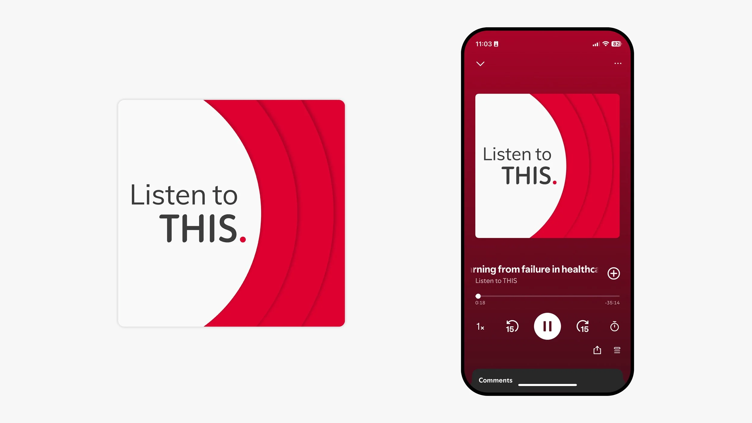
The first iteration of our work together has just launched. A podcast graphic for the second series of their ‘Listen to THIS.’ podcast.
They needed a graphic that would be eye-catching in a sea of competitive podcasts as well as retaining their distinctive colour palette and paper cut imagery style. The result is a bold graphic, with a nod to broadcasting their reseach across the airwaves.